Email campaign report
With RunSensible, you can get a complete report on how well all your email campaigns are doing. It gives you all the important details, like how many people opened your emails, clicked on links, and more. This helps you understand what’s working and what needs improvement, so you can make your email marketing better and more effective.
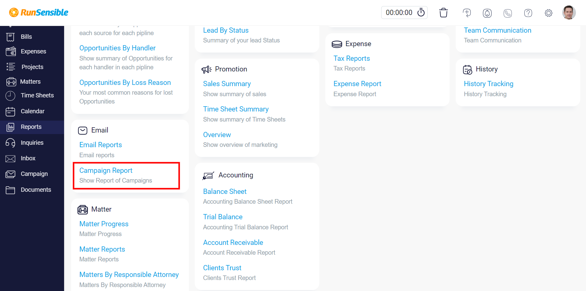
To access your email campaign reports, navigate to ‘Reports’ in the left sidebar menu and click on Campaign Report on the left bottom.
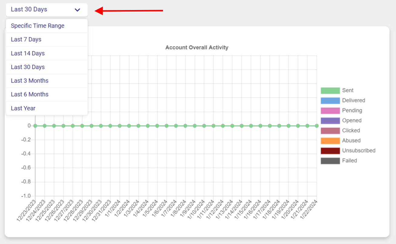
Once you’re there, you’ll find an analytic chart containing eight line graphs, each in a different color. Every graph focuses on a particular part of your email campaign and covers a specific time frame.
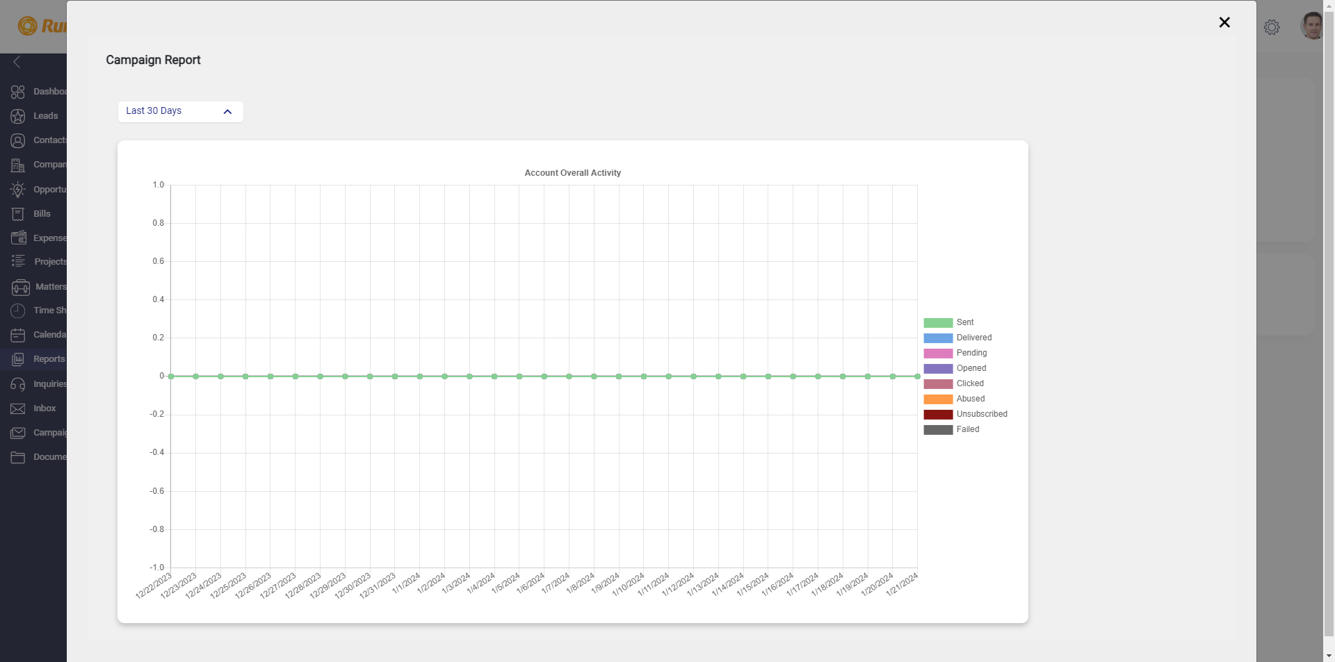
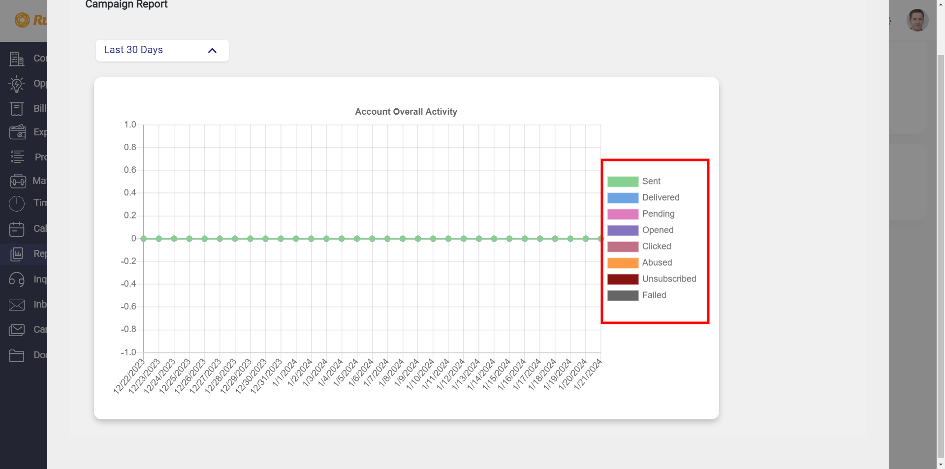
To understand what each graph represents, refer to the color-coded key on the right that corresponds to different aspects of your campaign.
The analytic chart is structured with two axes, each playing a crucial role in conveying a detailed understanding of your campaign’s performance.
The vertical axis serves as a scale representing the scores attained by your campaigns in specific aspects under consideration.
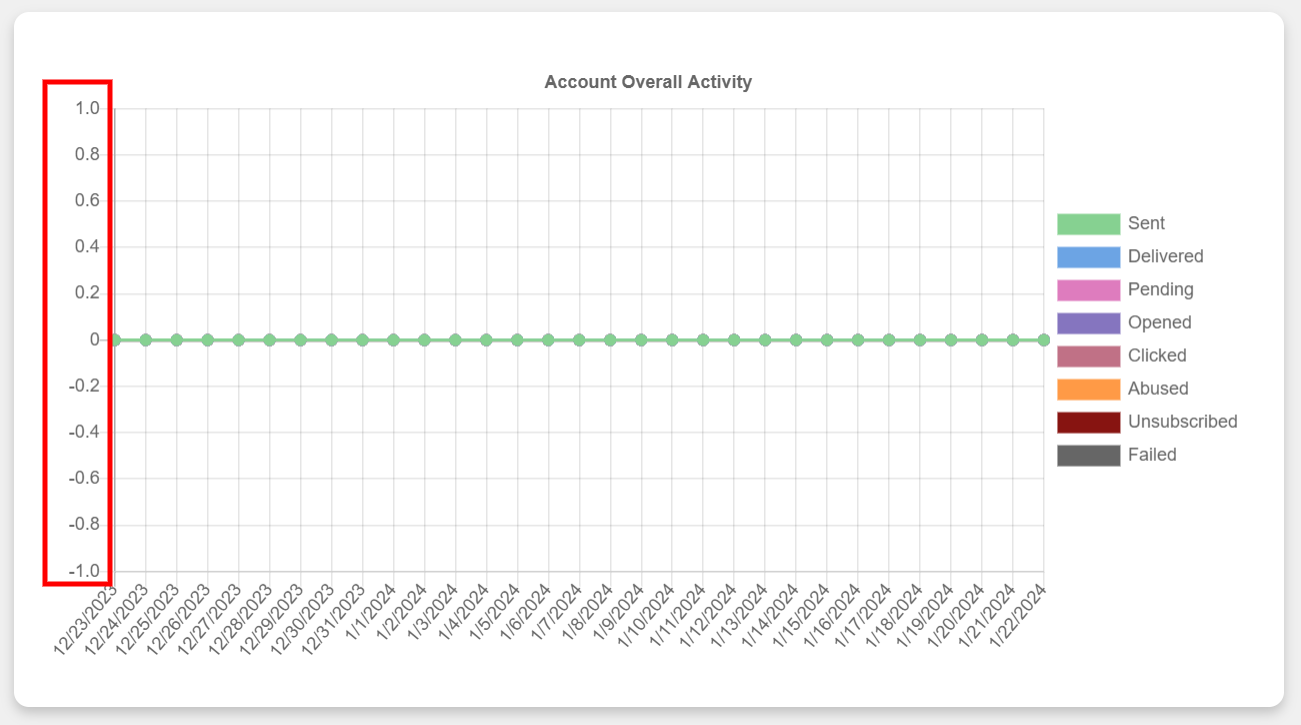
The horizontal axis is dedicated to illustrating the timeline, specifically denoting the dates on which your campaign achieved the corresponding scores.
Reading the chart involves examining the intersection points of these axes. For instance, if you focus on a particular date along the horizontal axis, you can trace upwards to the point where it intersects with the corresponding score on the vertical axis.
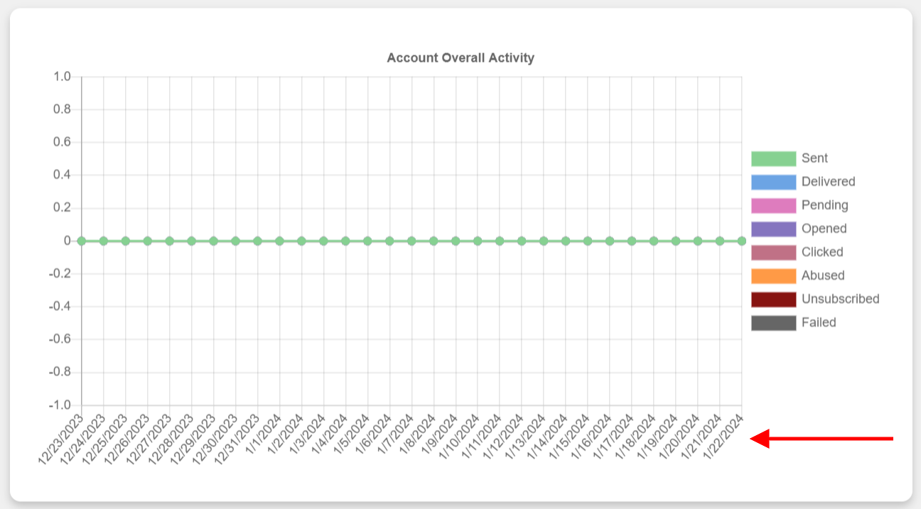
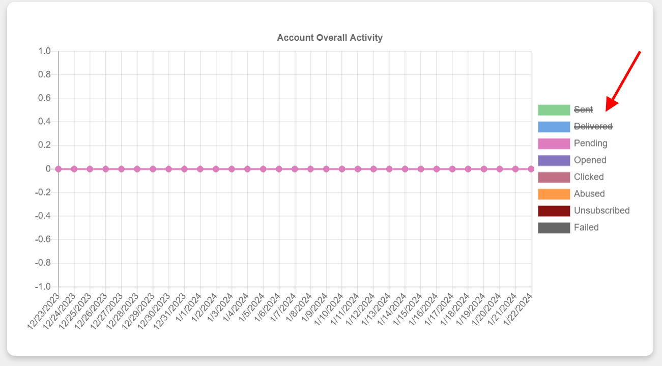
You can customize the chart and focus on specific aspects of your campaign.
This is particularly useful if you want to view a line graph for certain elements of your campaign, without other data cluttering the view.
To do so, look on the right side of the chart. click on the name of any factor you wish to hide on the chart’s right side, which lists the names of all the factors currently displayed.
To view the analysis of your campaign over a specific number of days, click on the Date drop-down menu in the top left corner of your screen.
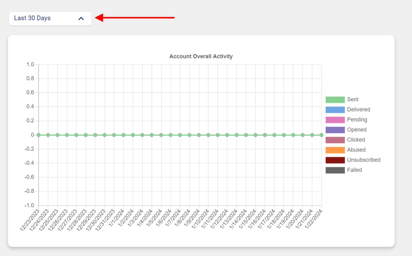
In this menu, you have two main options:
Predefined Date Range: If you’re interested in viewing data from a certain number of days leading up to the present (for example, the last 7 or 30 days), you can select one of the predefined options.
For a more detailed analysis of your data during a specific timeframe, click on the “Custom Date Range” in the date drop-down menu. Once selected, two boxes, labeled ‘From’ and ‘To,’ will appear on the right side of the menu. In the ‘From‘ box, input the start date of the period you’re interested in, and in the ‘To‘ box, enter the end date. This way, you can precisely focus on and examine data only within your chosen timeframe, gaining insights tailored to that specific period.
Once you’ve input these dates, the system will automatically update the display to only show data from this specified period.