Intake Form Question Fields
Basic Form Elements
Some elements are simple and require little setup. These include common information fields such as name, address, email, phone number, and similar basic questions. These elements are used to collect standard information from the person filling out the form.
The Business Info element is different because it does not collect information from the lead. Instead, it displays the firm’s business information on the form. When this element is added to the form, a customization panel opens on the right side. This panel allows the user to control which business details appear on the form.
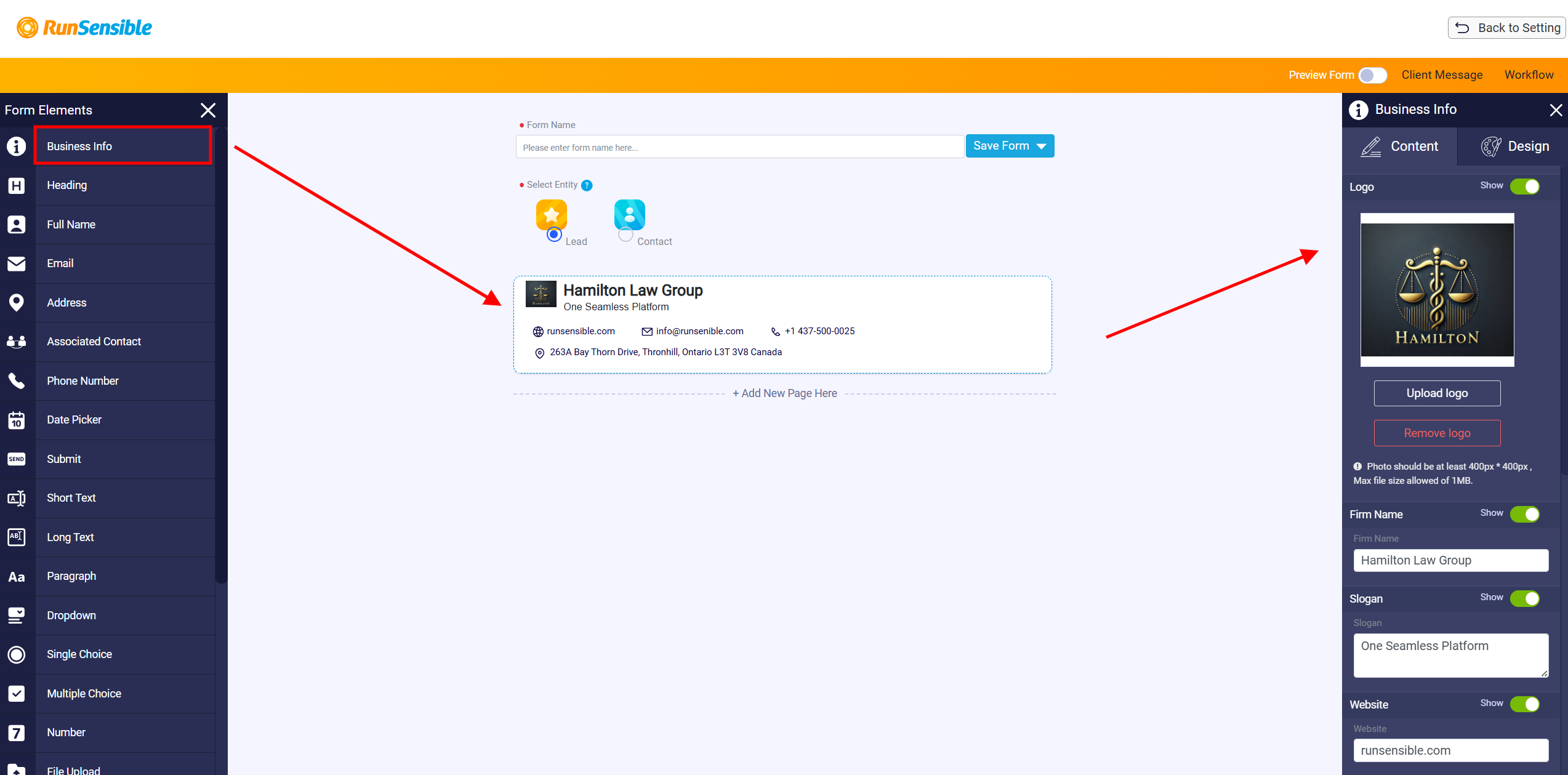
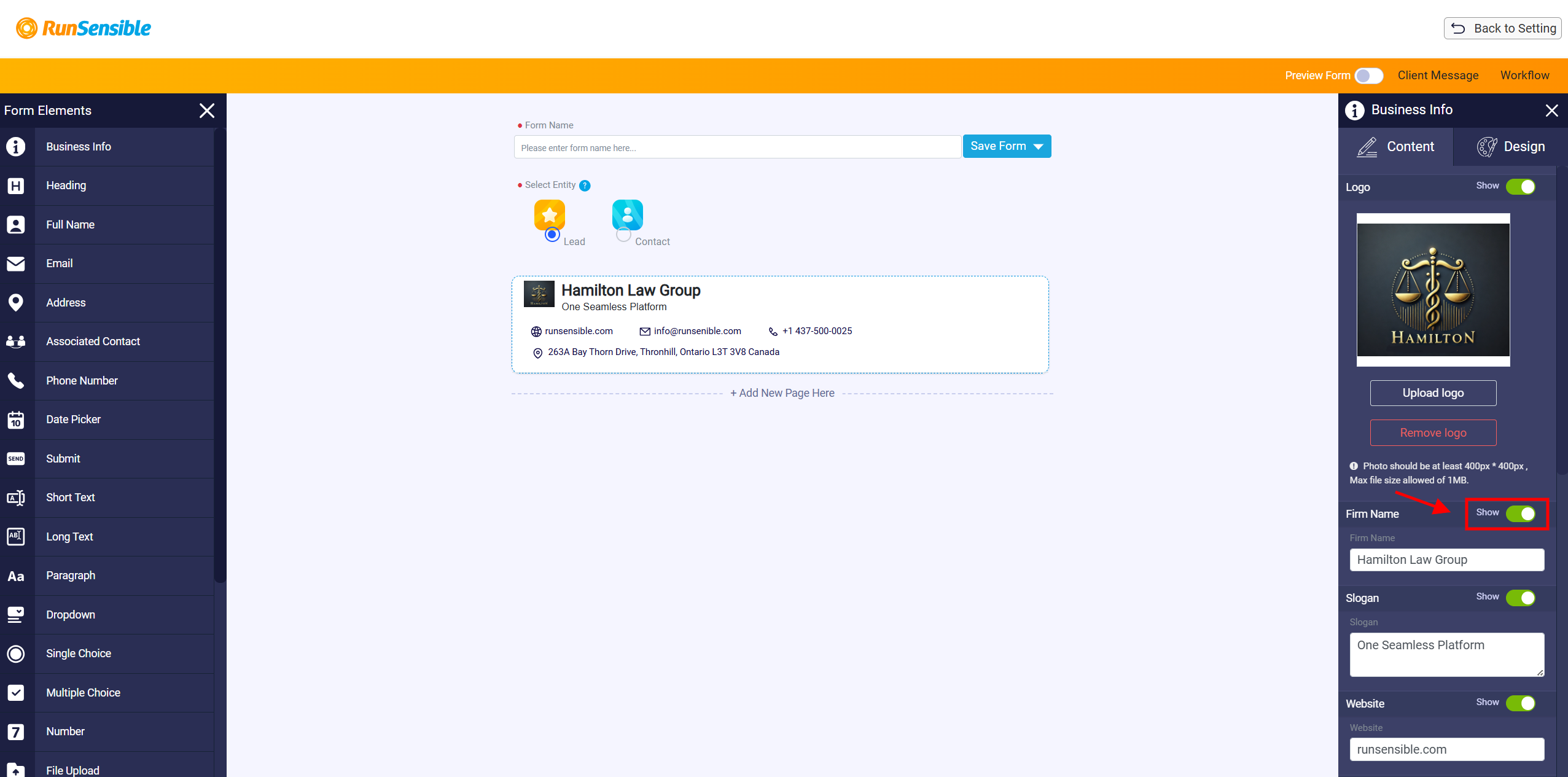
The Business Info customization panel is used to manage the business details shown on the intake form. The user can upload or remove a logo, and the logo can be shown or hidden using its Show toggle. Each business information field also has its own Show toggle. When a toggle is turned on, that information appears on the form. When it is turned off, that information is hidden. The panel may include fields such as firm name, slogan, website, email, phone, fax, and address details. Any information entered in this panel is displayed in the business information block on the intake form.
The first seven elements that follow the Business Info element in the form elements panel consist of commonly asked questions that you may need to pose to your clients. These include fields for collecting their names, addresses, email addresses, and other essential information. These elements are designed to be straightforward and require minimal customization. This simplicity allows us to quickly move through these basic elements and concentrate on exploring the more advanced options available in the later sections of the panel, where we can further tailor the form to meet specific needs and preferences.
Associated Contact Element
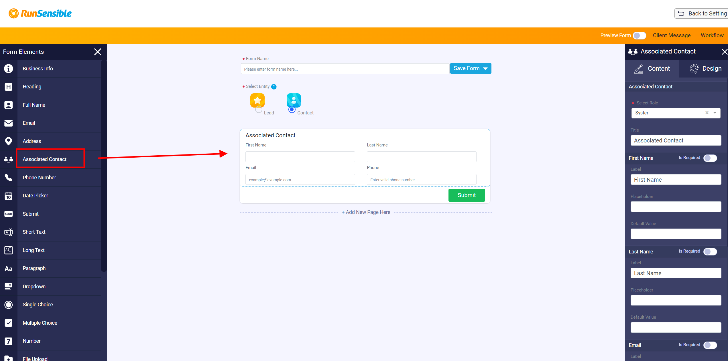
The Associated Contact element is only used for Contact forms. It should not be used when creating an intake form for leads. If the form is being created for leads, this element is not applicable.
Text Response Elements
The Short Text and Long Text elements are used when the form needs the person to type an answer. The Short Text element is best for brief answers, while the Long Text element is better when the person needs to provide a longer explanation.
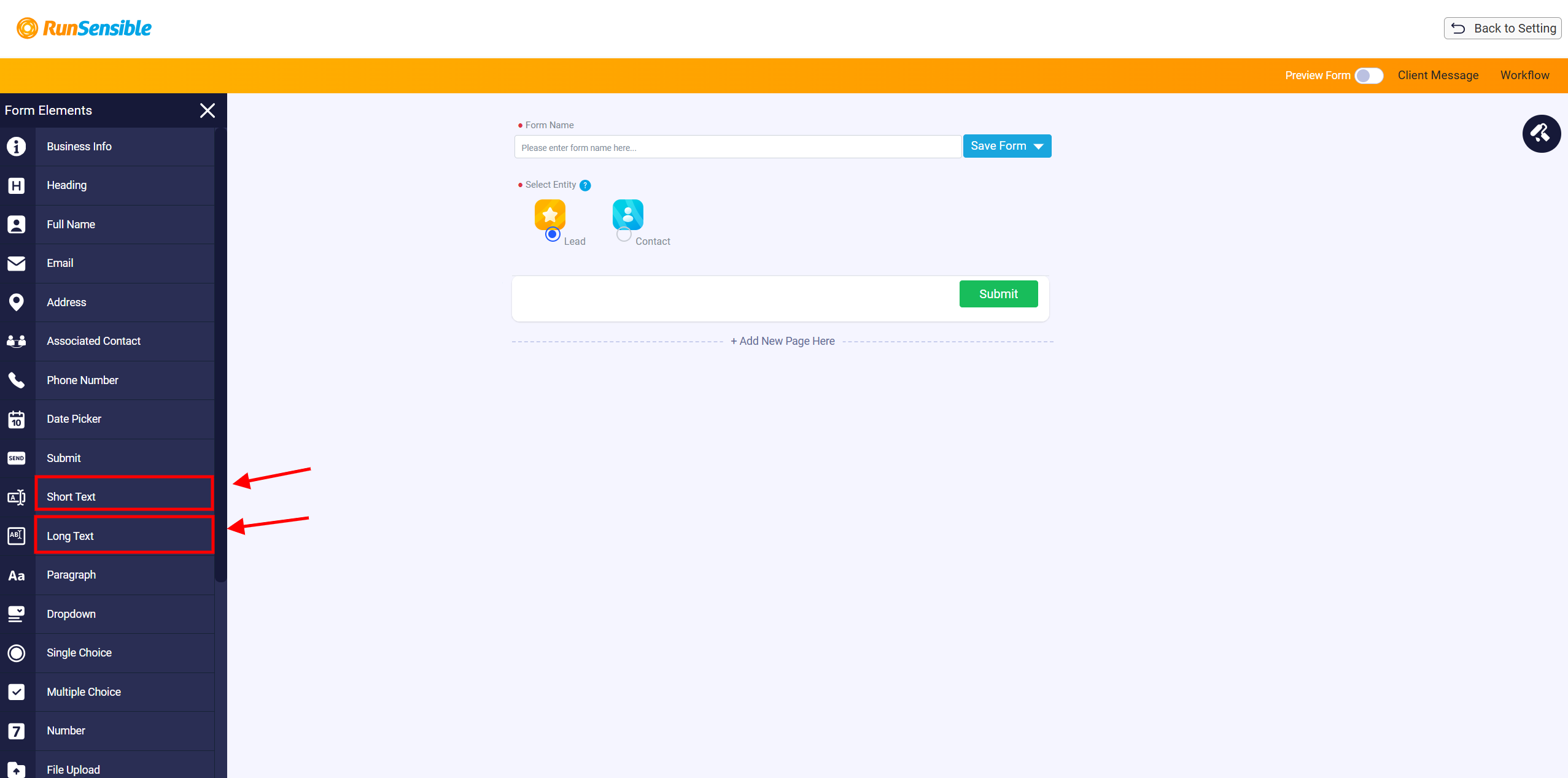
After one of these elements is added to the form, a customization panel opens on the right side. In this panel, the user can enter the question, add a title, set a placeholder, or provide a default value. The placeholder can be used to guide the person on what to enter. The default value can be used when the form creator wants to provide a suggested answer or starting text.
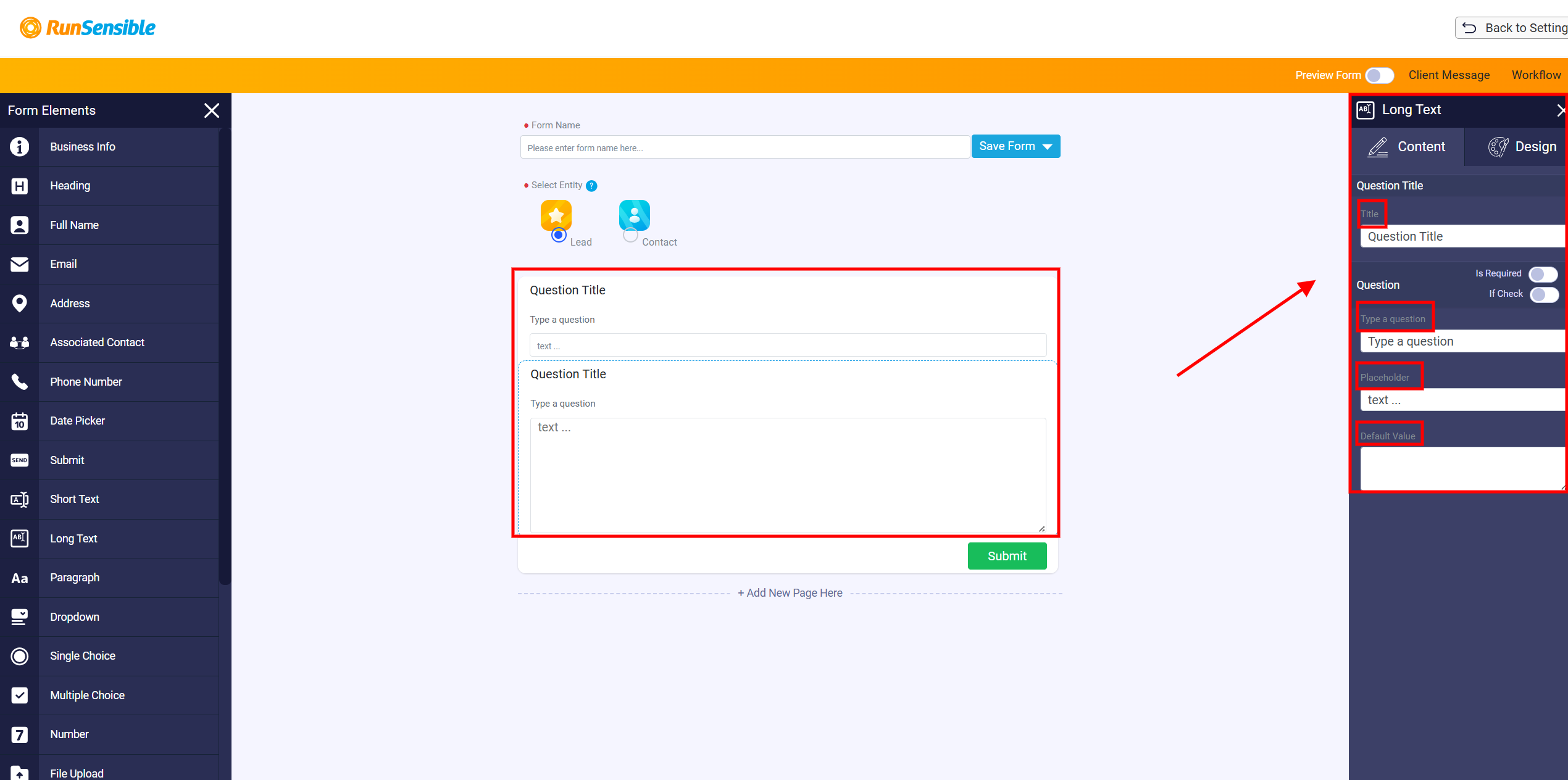
These text elements also include two important toggles. The Is Required toggle controls whether the question must be answered before the form can be submitted. If it is turned on, the person filling out the form cannot submit the form without answering that question. If it is turned off, the question is optional.
The If Check toggle adds a checkbox beside the question. When this option is turned on, the person must first check the box, and then the related text field appears so they can provide more information. This is useful when the question needs a confirmation first, followed by an explanation or additional details.
Paragraph Element
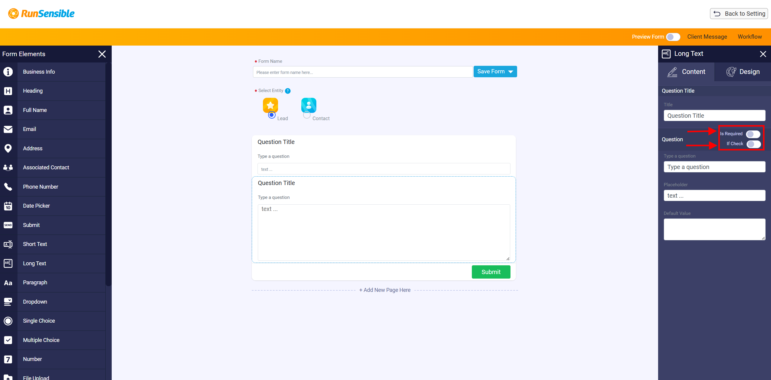
The Paragraph element is used to add text that the form creator wants to display on the form. This text is not answered or edited by the person filling out the form. It is used for instructions, explanations, descriptions, or any other information the form creator wants the person to read. The form creator controls the paragraph content. The person filling out the form can view it, but cannot change it. This makes the paragraph element useful for giving clear guidance throughout the form.
Selection Elements
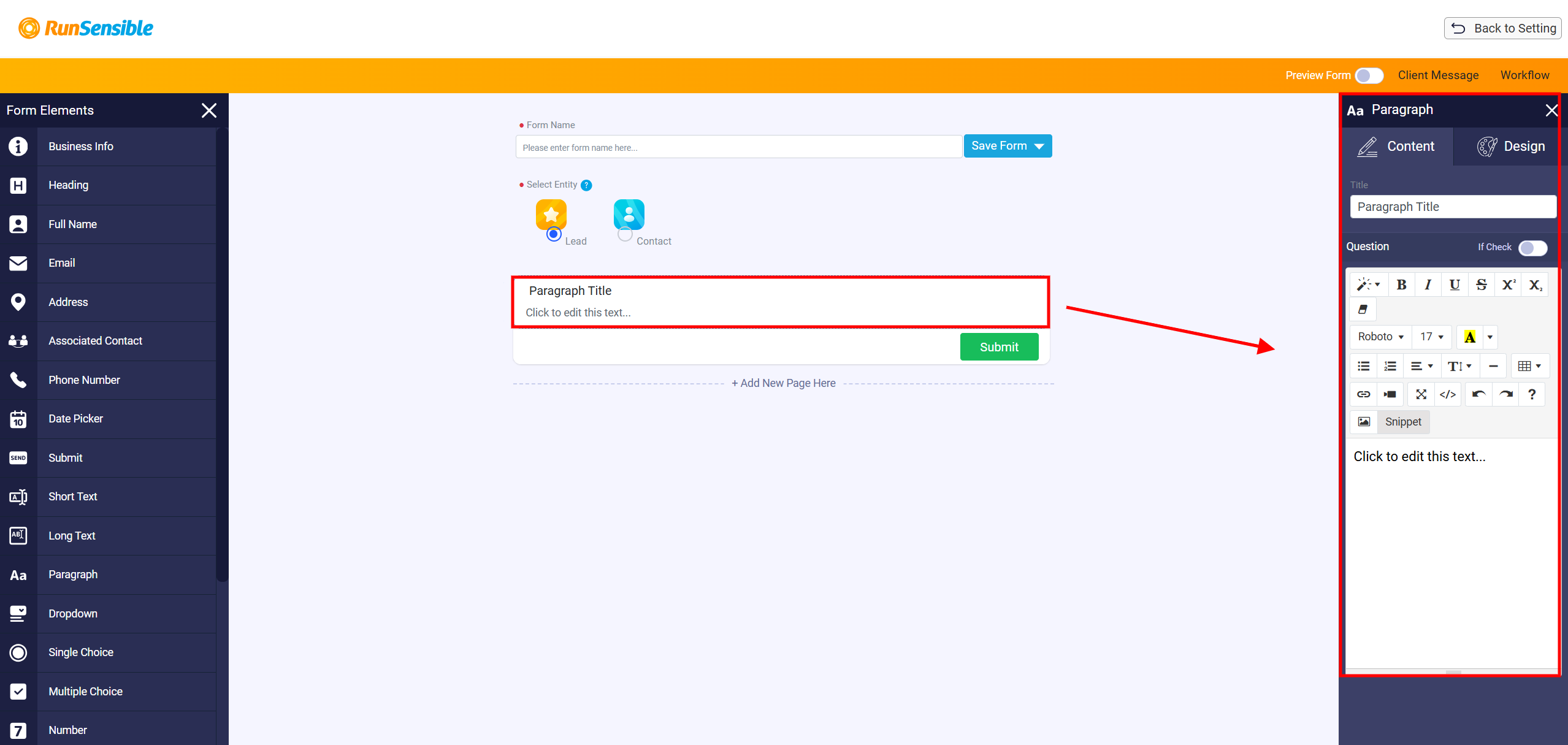
The Dropdown, Single Choice, and Multiple Choice elements are used when the person filling out the form needs to choose from a set of predefined answers. These elements help keep responses clear and consistent because the person selects from the options created by the form builder instead of typing their own answer.
A Dropdown allows the person to choose one answer from a dropdown menu. A Single Choice element also allows only one answer, but the options are displayed directly on the form. A Multiple Choice element allows the person to select more than one answer. After adding one of these elements, the customization panel opens on the right side. This panel is used to set up the question, title, answer options, and default value.
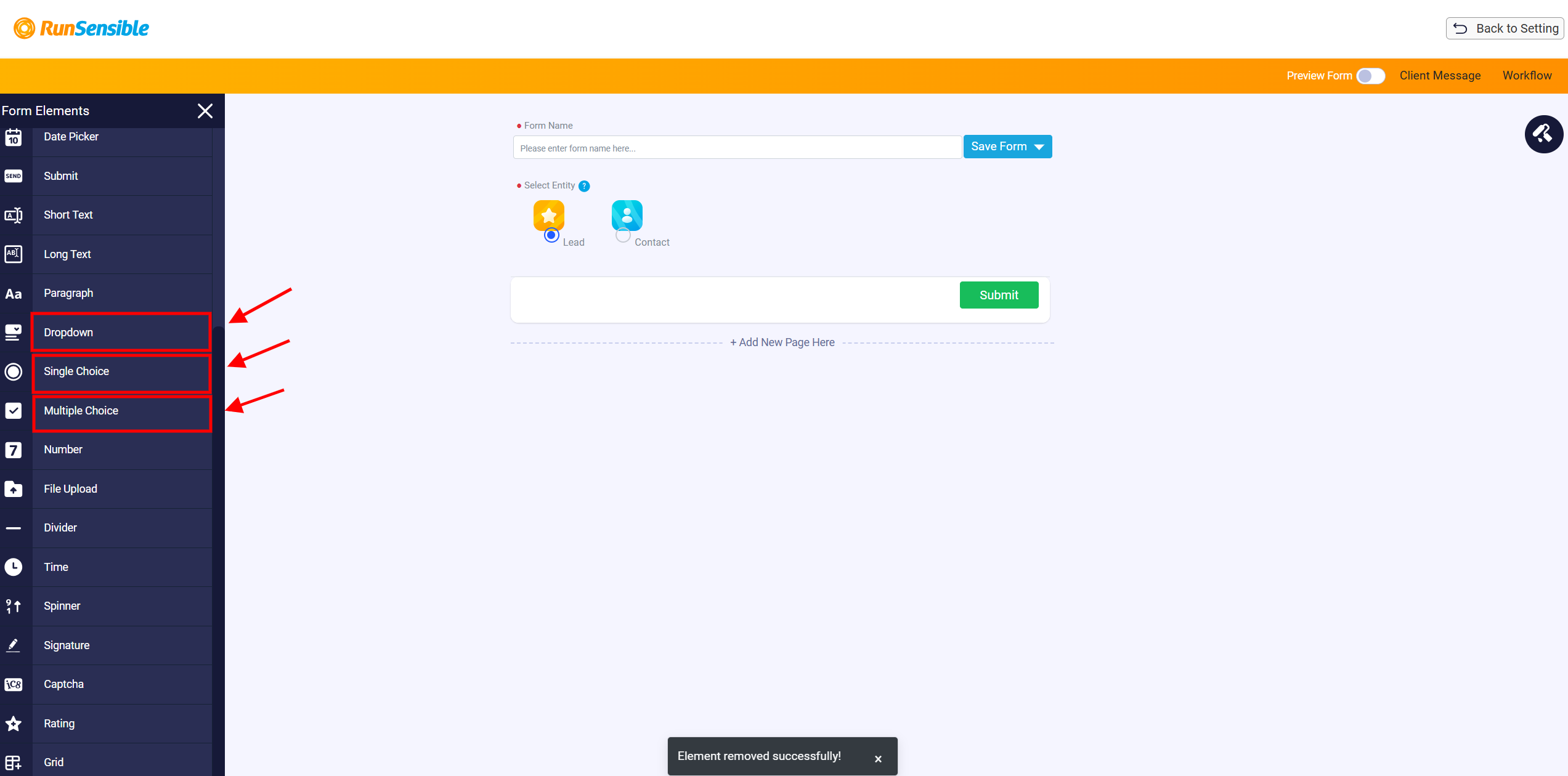
The question should be entered in the Type a question field, and the title can be entered in the Title box. The form creator can also add or edit the answer options that will be shown to the person filling out the form. To choose a default answer, click the Default Value dropdown and select the option that should appear as the default selection. By default, each choice element starts with three option rows. The form creator can click Add to create more options or use the delete button beside an option to remove it from the list.
To customize your paragraph, start by entering a title in the Title box at the top of the right-side menu. Then, input your desired text in the Text box. Above the text box, you’ll find a ribbon with various tools that allow you to modify the style and formatting of your paragraph.
Additionally, there is a toggle button labeled Is Required in this panel. If you toggle this button on, the paragraph will only be shown to the form filler if they check a box located at the top left side of the form.
Number and Spinner Elements
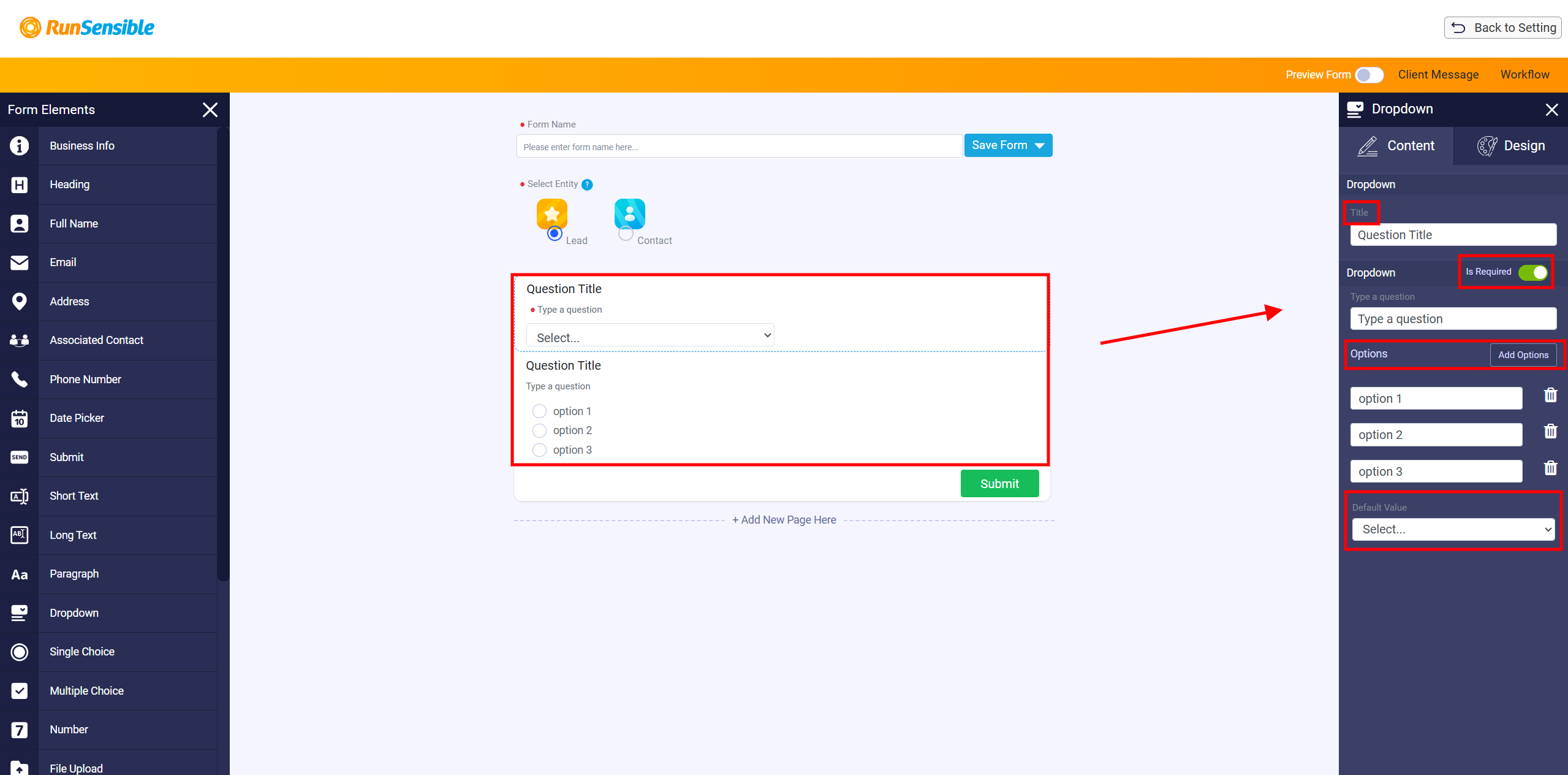
The Number and Spinner elements are used when the form needs a numeric answer. Both elements collect numbers, but they work best in slightly different situations. The Number element is useful when the person may need to enter a larger or more specific number manually. The Spinner element is useful for smaller numbers because the person can increase or decrease the value using the controls instead of typing it manually.
File Upload Element
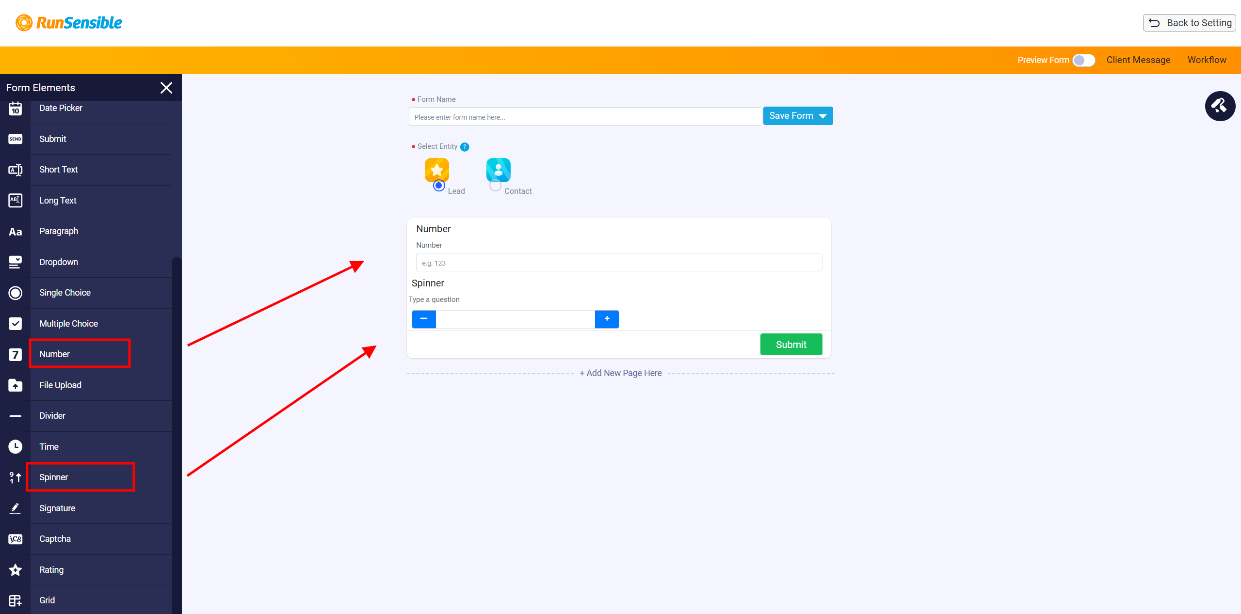
The File Upload element is used when the form needs the person to submit a document, image, or other file. This is useful when the firm needs supporting documents as part of the intake process. After adding the file upload element, the form creator can use the right-side customization panel to explain what file should be uploaded. This helps the person understand exactly what document or file is needed.
Time Element
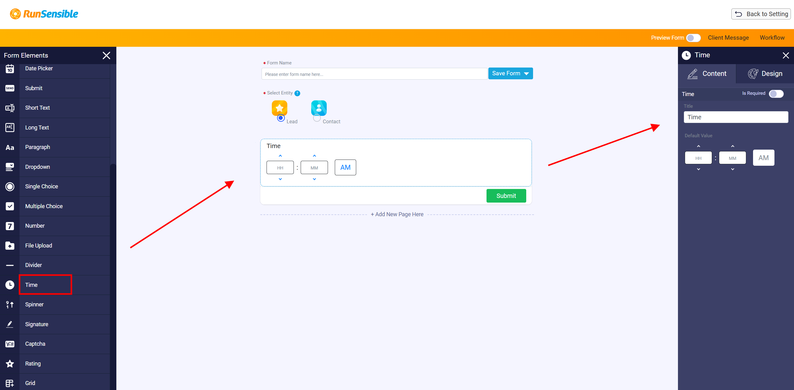
The Time element is used when the form needs to collect time-related information. This may be useful for appointment scheduling, event timing, availability, or any other situation where the person needs to provide a time.
Signature Element
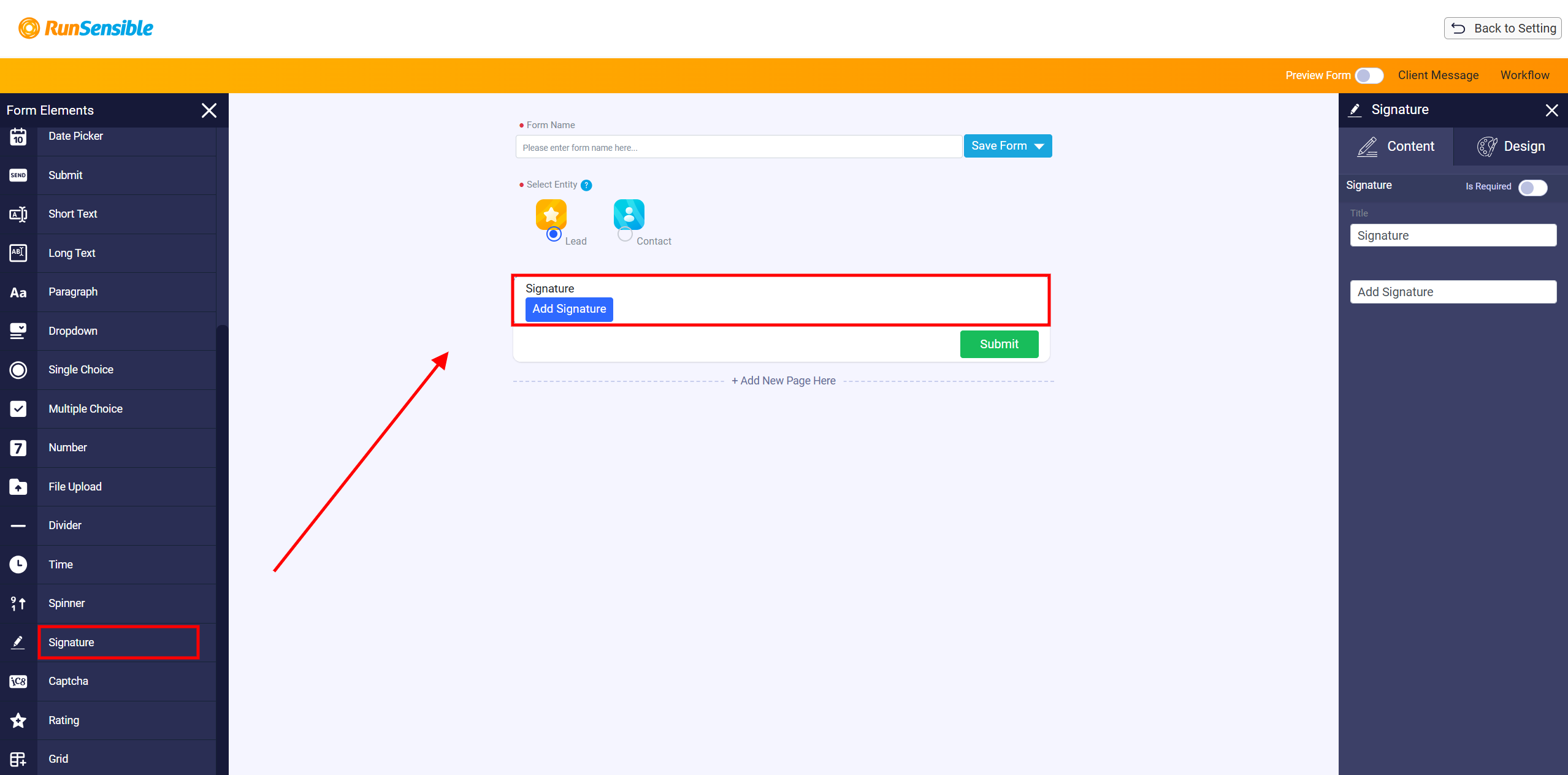
The Signature element is used when the form needs the person to provide a signature. This can be used for confirmation, consent, approval, or agreement.
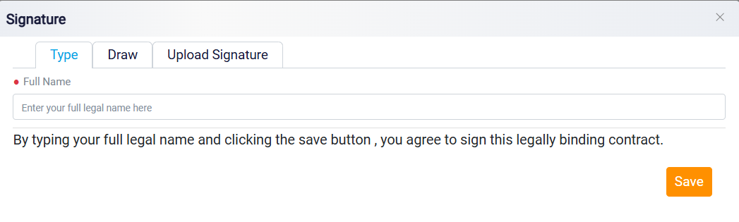
When the person clicks Add Signature, a signature panel opens. The person can add a signature in three ways. The Type option allows them to enter their full legal name and preview the typed signature. The Draw option allows them to draw their signature directly on the screen. The Upload Signature option allows them to upload an existing signature image from their device. If the person draws a signature and makes a mistake, they can use Clear to remove it and try again. After the signature is saved, it becomes part of the submitted intake form.
Captcha Element
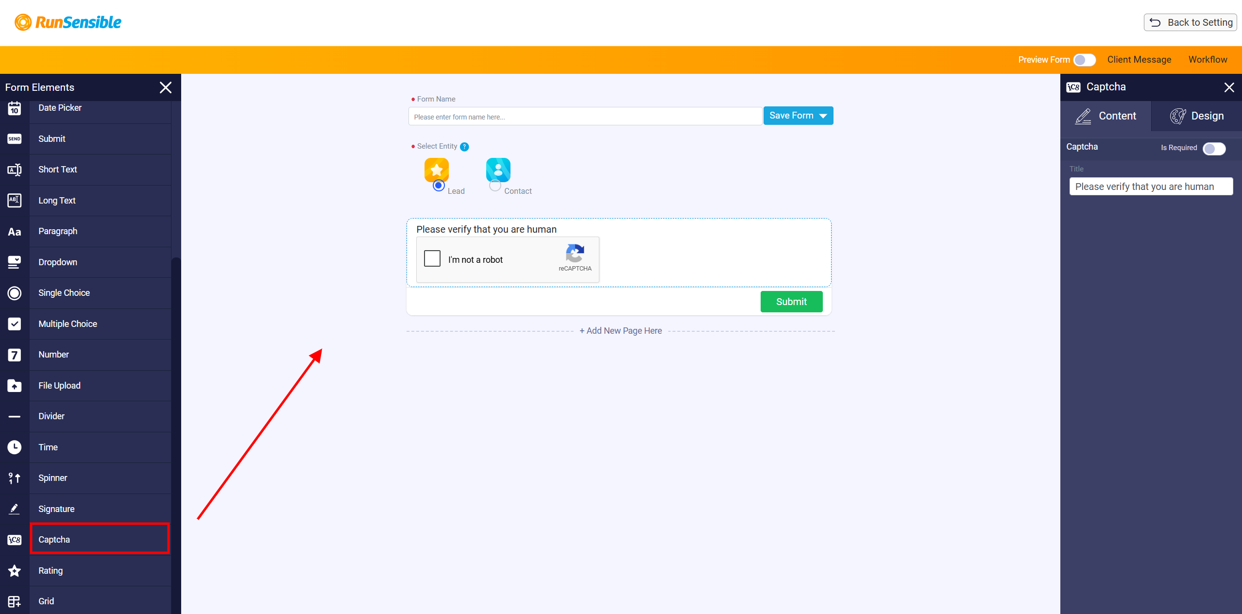
The Captcha element is used to confirm that the person filling out the form is a real person and not an automated bot. It adds a simple verification step before the form can be submitted. This element is especially useful when the intake form is shared through a public link or sent outside the system, because it helps reduce spam or automated submissions.
Rating Element
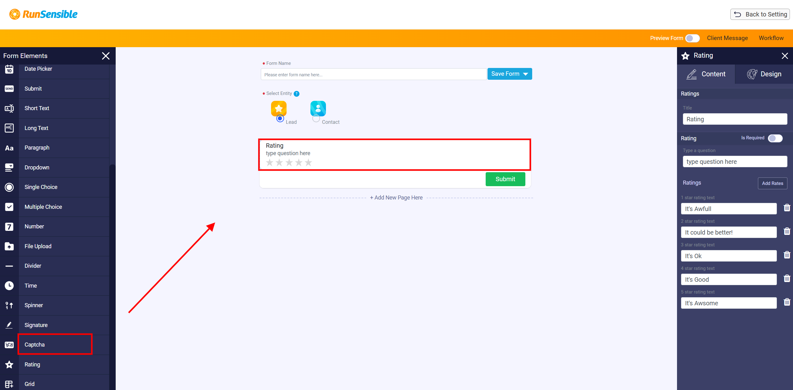
The Rating element is used when the form needs the person to give a score or opinion. It usually appears as a row of stars that the person can select. This element is useful for feedback, satisfaction level, service quality, or any question that is better answered with a rating instead of written text.
Grid Element
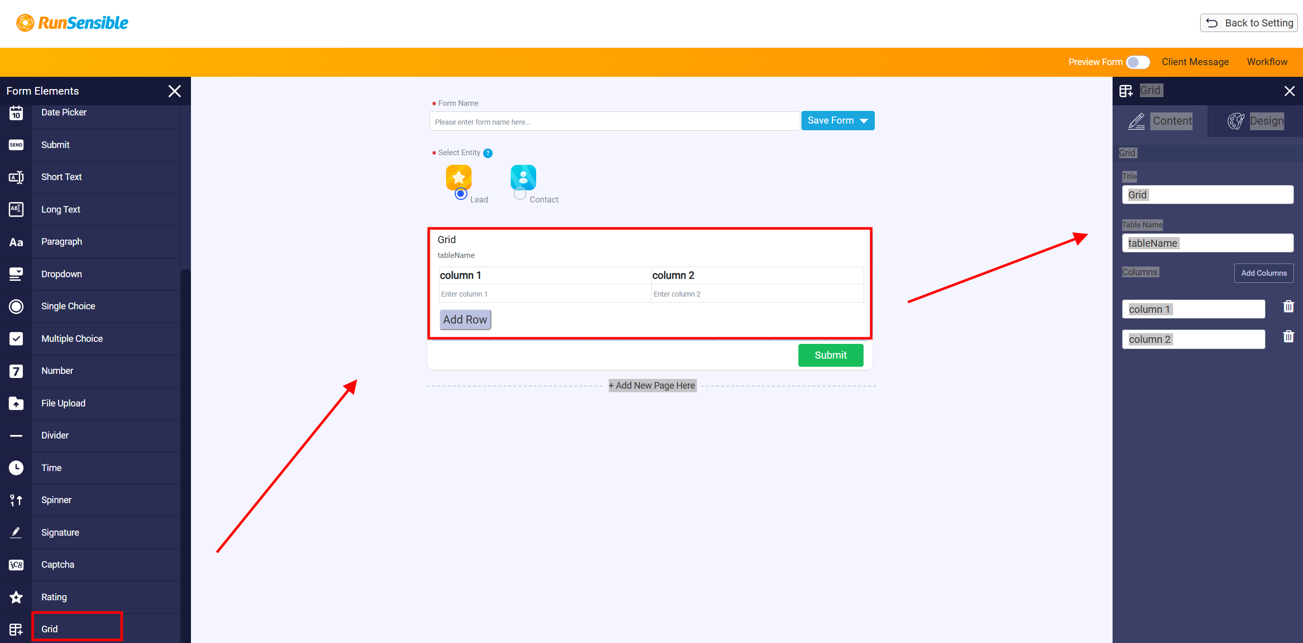
The Grid element is used when the form needs to collect information in a table format. Instead of asking separate repeated questions, the grid allows the person to enter related information into rows and columns. The form creator controls the columns and decides what information needs to be collected. The person filling out the form can add as many rows as needed to enter all related information. For example, if the same type of information must be repeated several times, the person can click Add Row to add more entries. If a row is not needed, it can be removed using the delete icon.
The grid customization panel allows the form creator to set the title, table name, and column names. The creator can add more columns or remove columns based on what information should be collected.
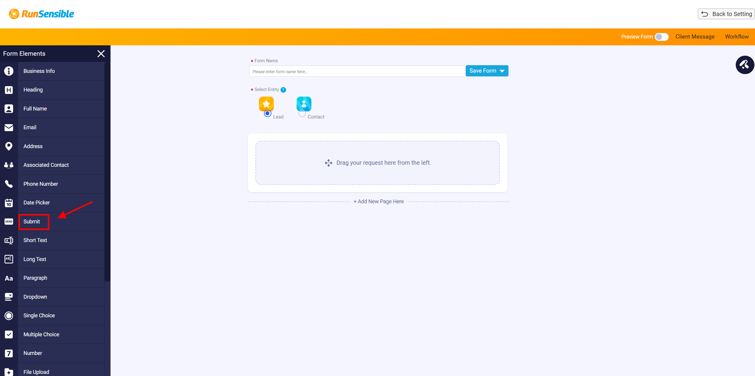
Every intake form must include a Submit button. This button allows the person filling out the form to send their answers. If the form does not include a submit button, the person will not be able to submit the completed form.
Note: Keep in mind that if you don’t include the submit button in your intake form, no one will be able to send you the information.
Saving an Intake Form
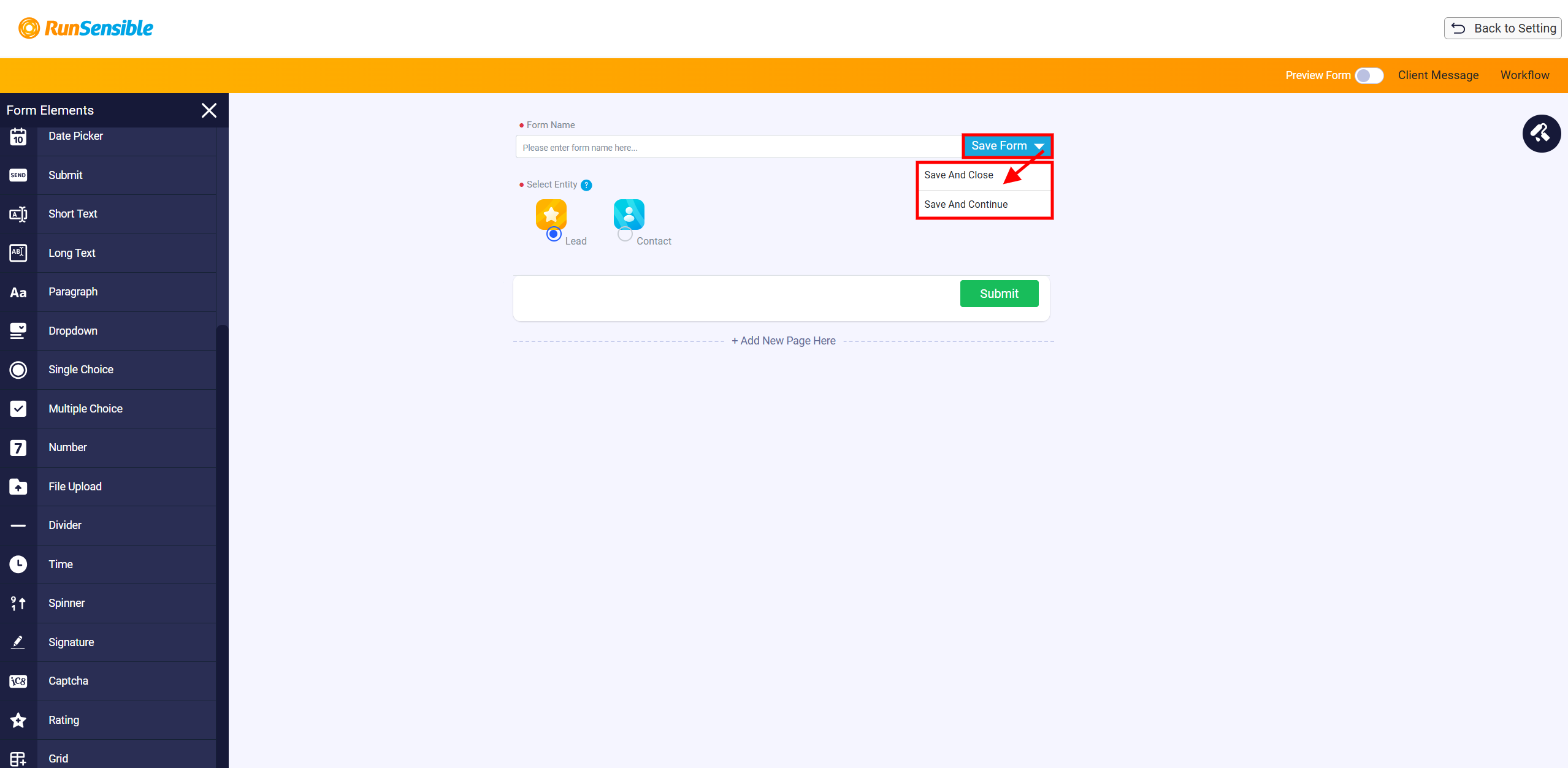
After creating the intake form, click Save at the top right side of the form builder. Two options will appear: Save and Close and Save and Continue. Save and Close saves the intake form and returns the user to the lead detail page where the form creation process started. Save and Continue saves the form but keeps the user inside the builder so they can keep editing. No matter which option is selected, the intake form is saved in the intake form template list and can be used later in the Intake Forms tab of a lead record.
Customizing Form Elements
When you drop an element, a panel will appear on the right side of your screen. Within this panel, you’ll notice two tabs: Content and Design.
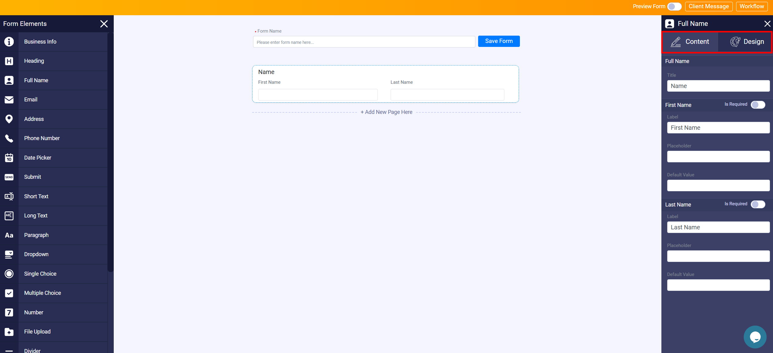
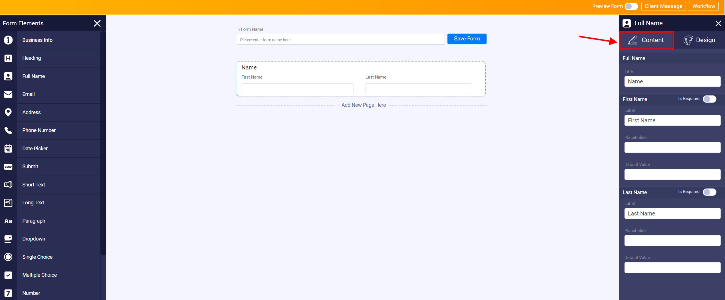
The Content tab allows you to assign a title and pose your desired question for each element. Use this tab to provide clear instructions or gather specific information from your form respondents.
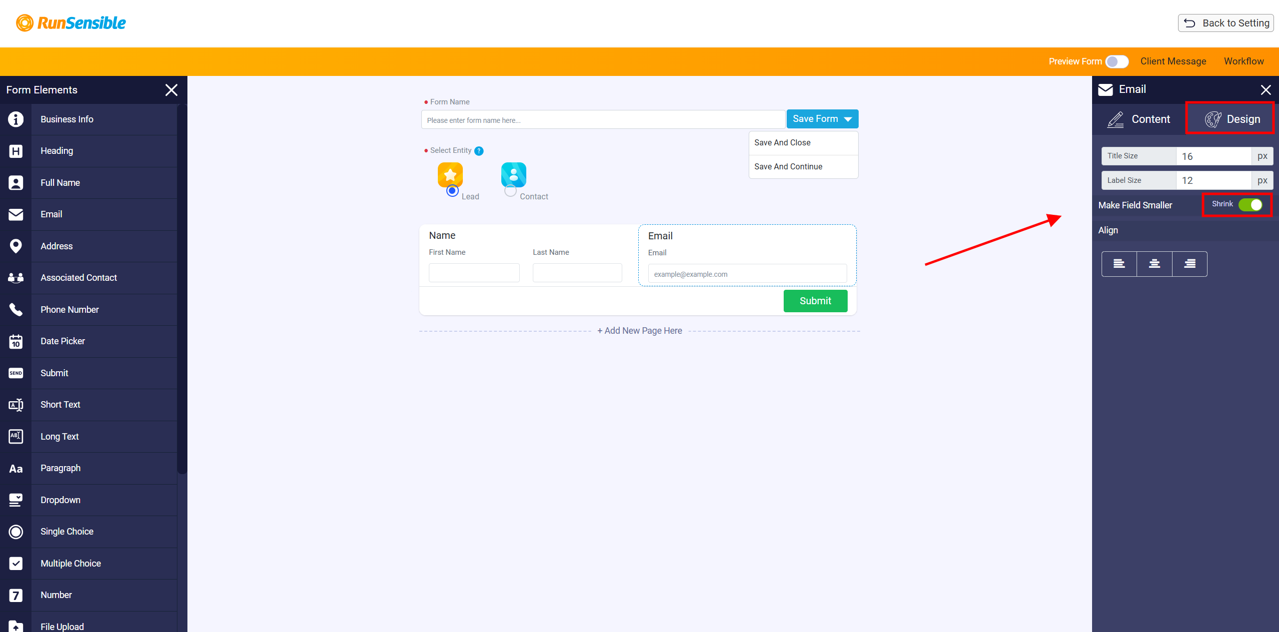
On the other hand, the Design tab offers visual customization options for the elements. You can adjust their appearance to match your preferences. If you wish to create a more compact form layout, you can utilize the Shrink button available in the Design tab. Clicking on this button will insert a second column into your form, helping you achieve a more condensed design.
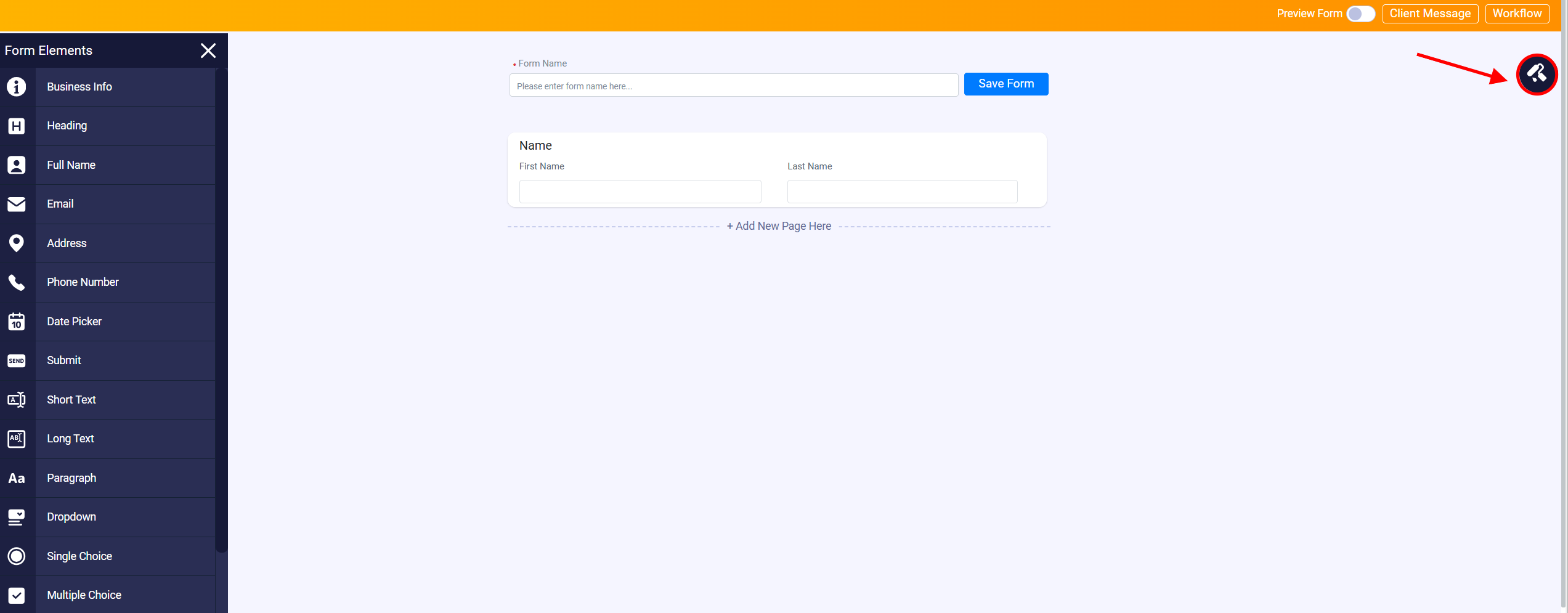
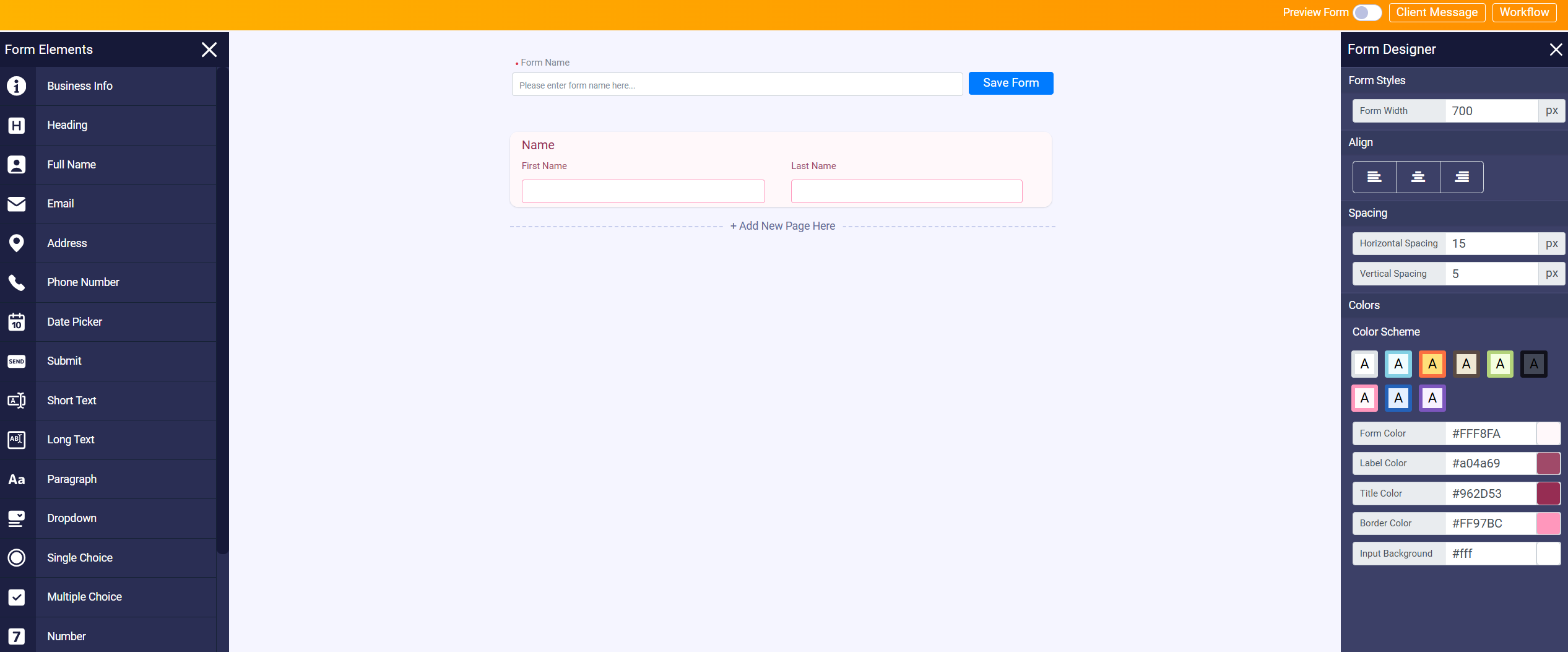
Once you have completed all the steps, dismiss the element customize panel and click the Form Designer button on your top right to modify the design of your intake form.
As you can see, you can change the size and the background color of your intake form. There are color combinations suggested, but you can change them by clicking on the color you want.
In the upper right corner of your screen, you’ll find the Preview Form button.
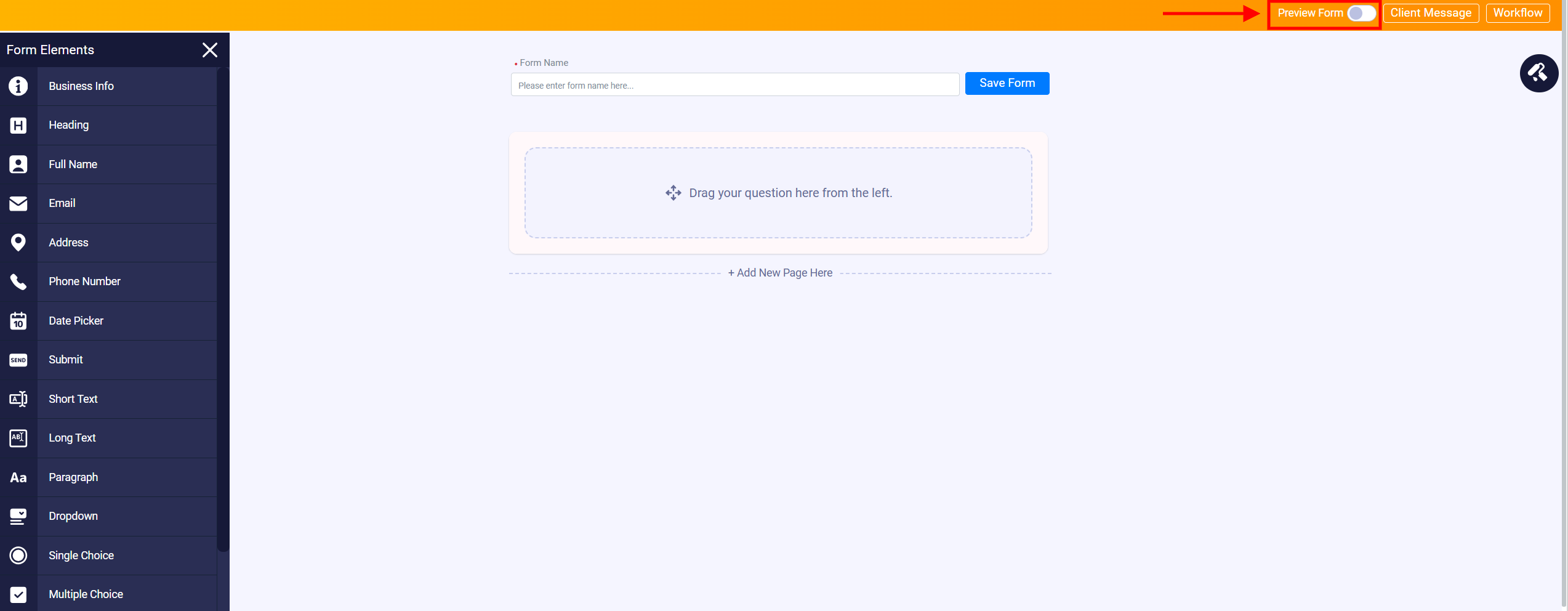
This button allows you to see a live version of your form on any device, so you can make sure that the form looks well-designed and functions correctly on different screen sizes and devices.
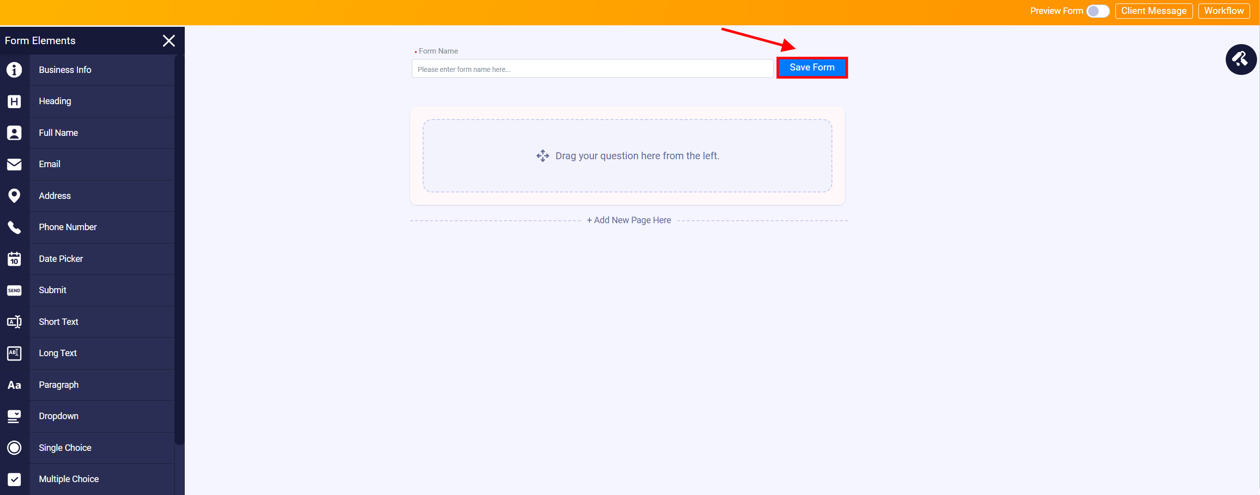
After completing the intake form, make sure to click Save Form.