Leads Custom Fields
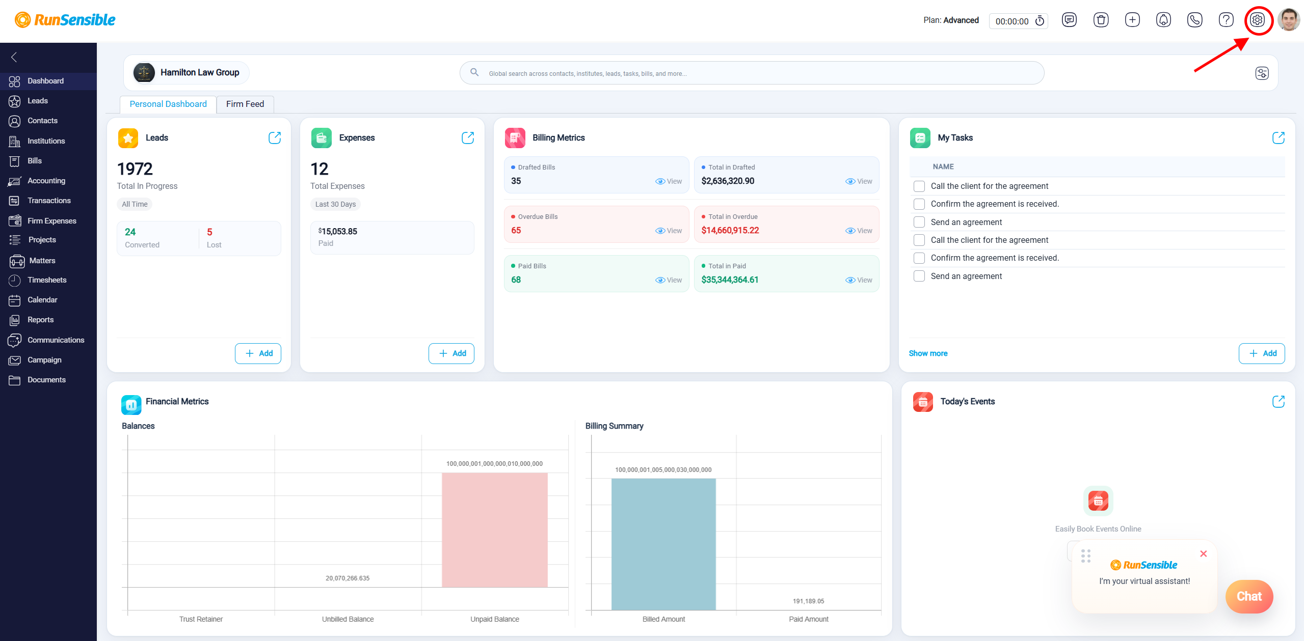
Lead information fields can be customized based on the firm’s needs. To manage custom fields, go to Settings, then open Contacts & Leads from the left-side menu and select Custom Fields.
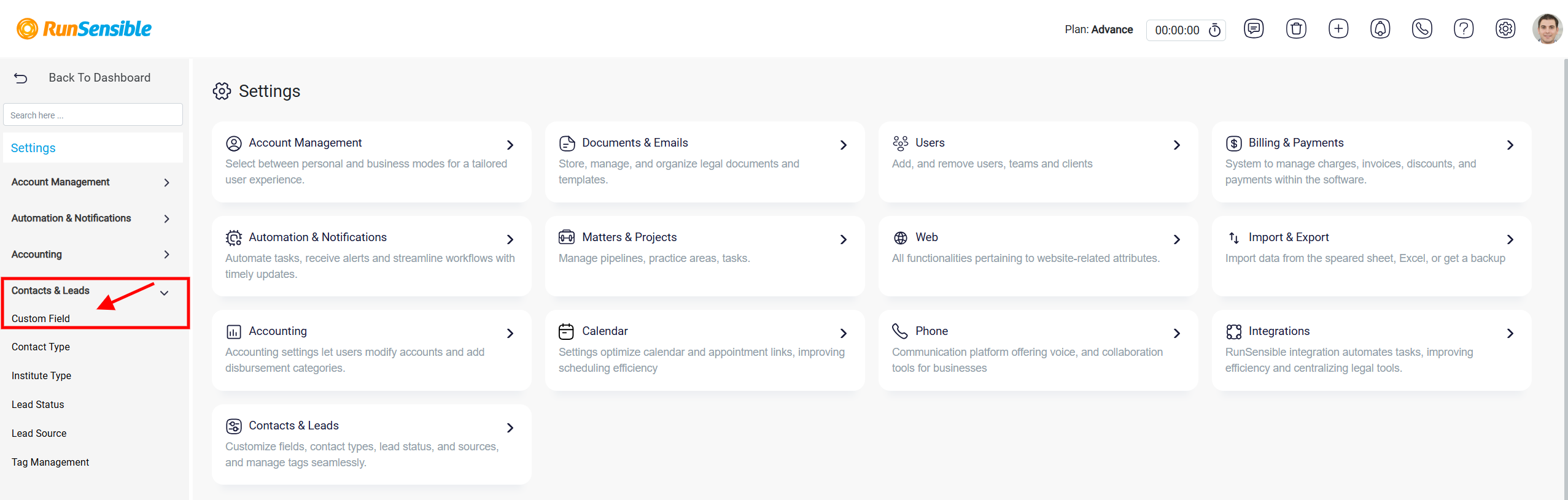
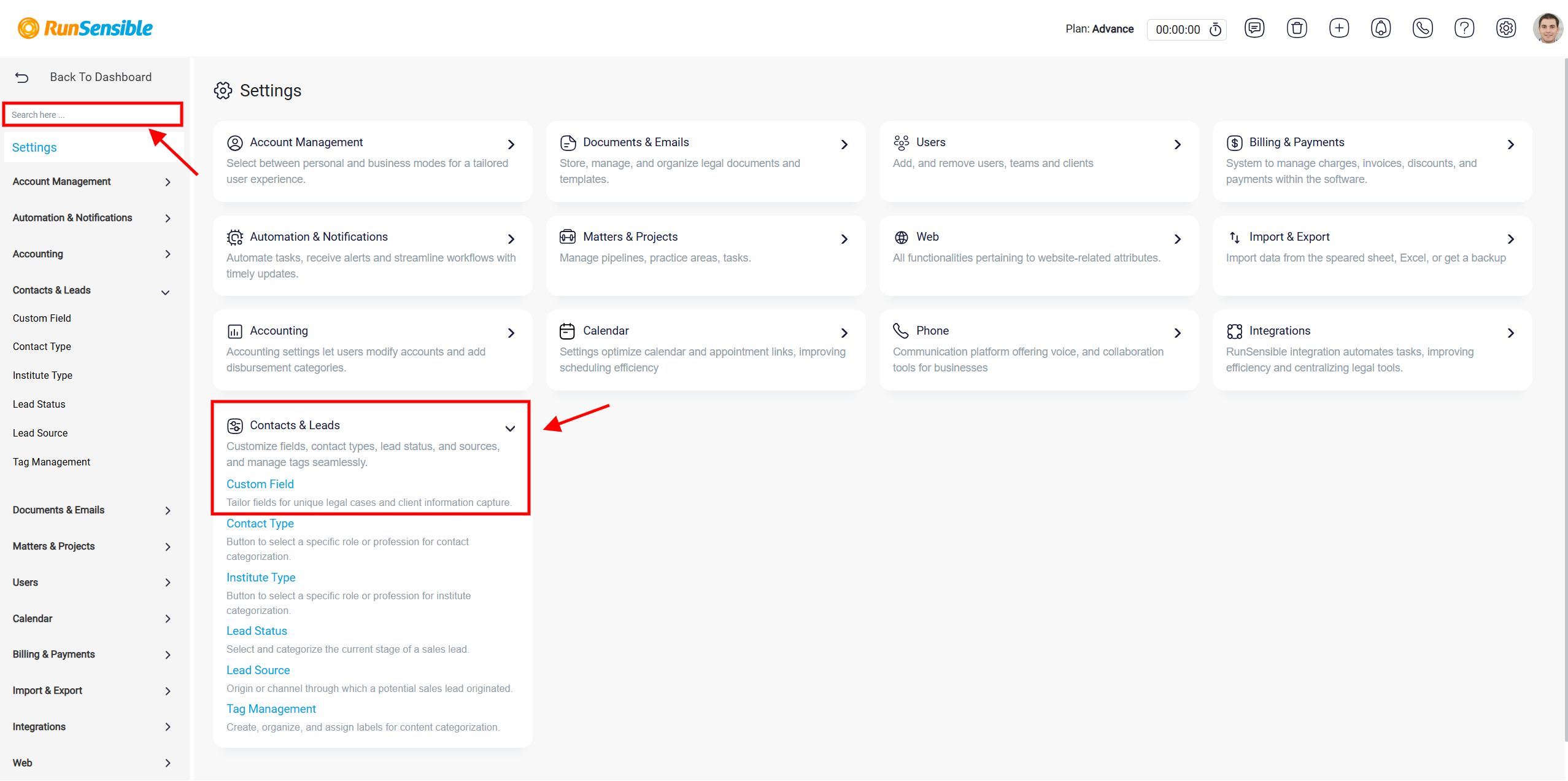
Alternatively, you can locate Custom Fields using the Search box or by selecting Contacts & Leads from the middle section of the page.
Once you’re on the page, navigate to Leads to modify its custom fields.
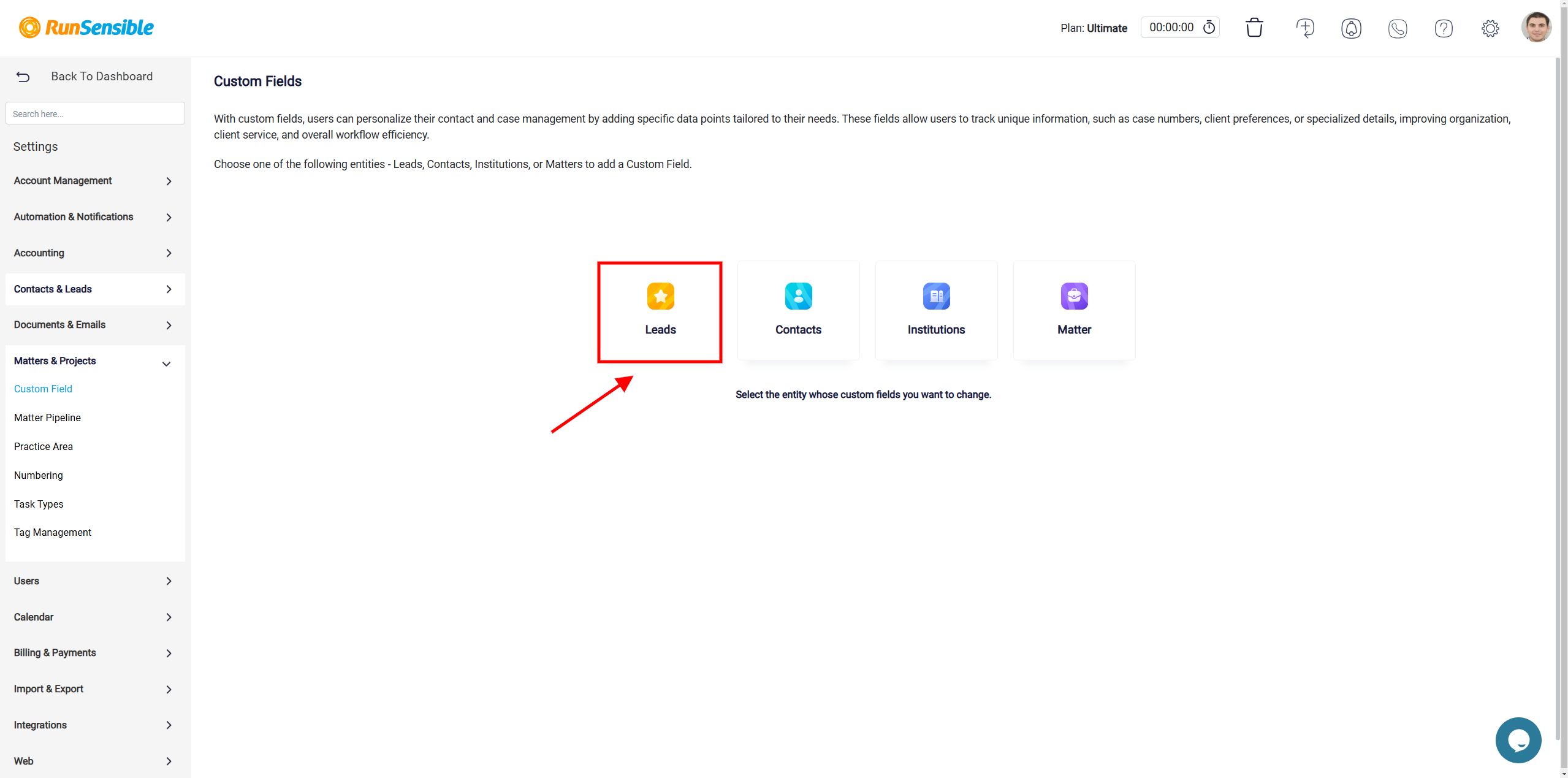
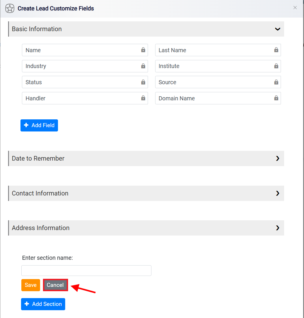
It features sections where you can categorize and input various types of information about Leads including Basic Information, Date to Remember, Contact Information, and Address Information.
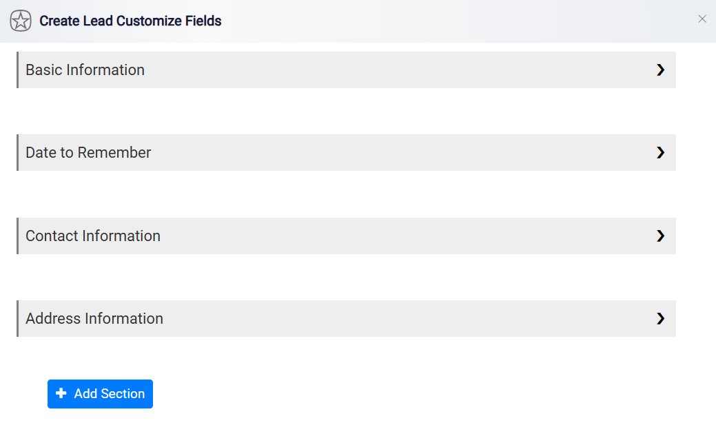
Entities come with predefined essential information sections and fixed custom fields that cannot be modified.
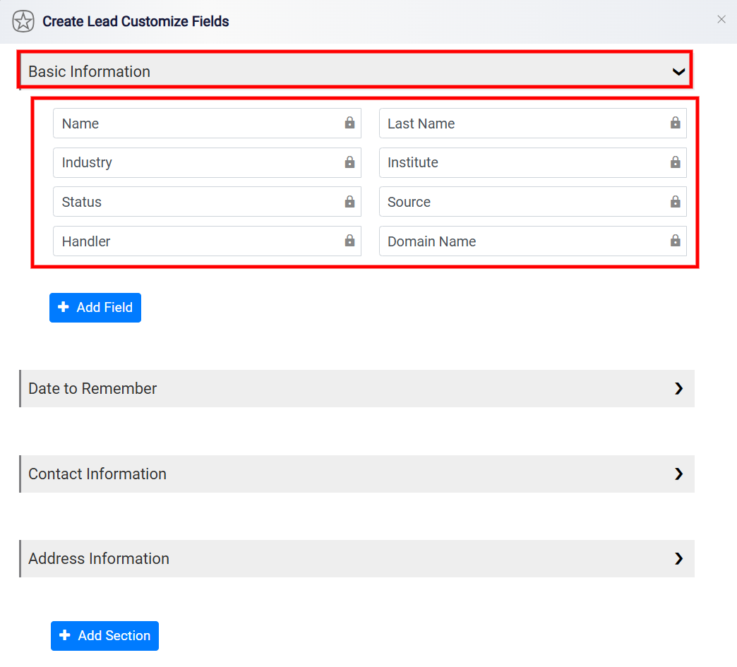
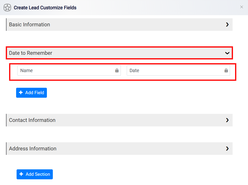
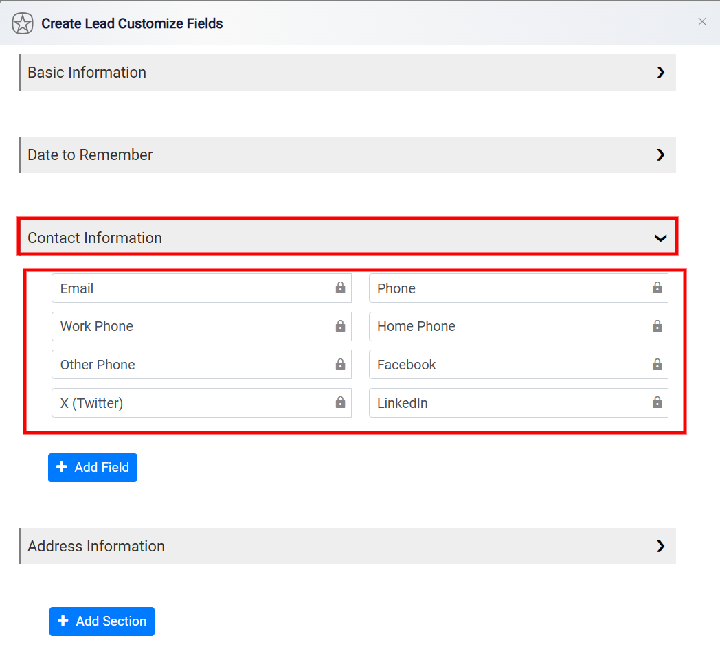
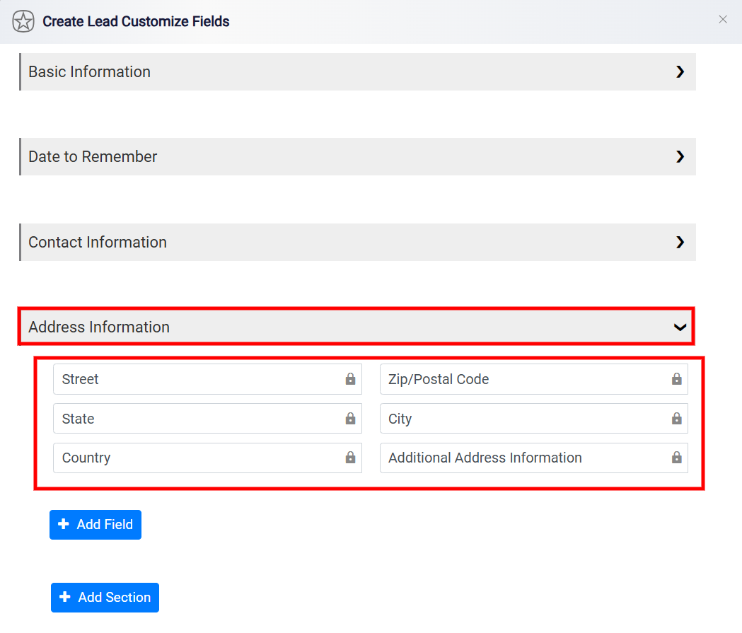
However, you can include as many additional information sections and custom fields as you need within each section.
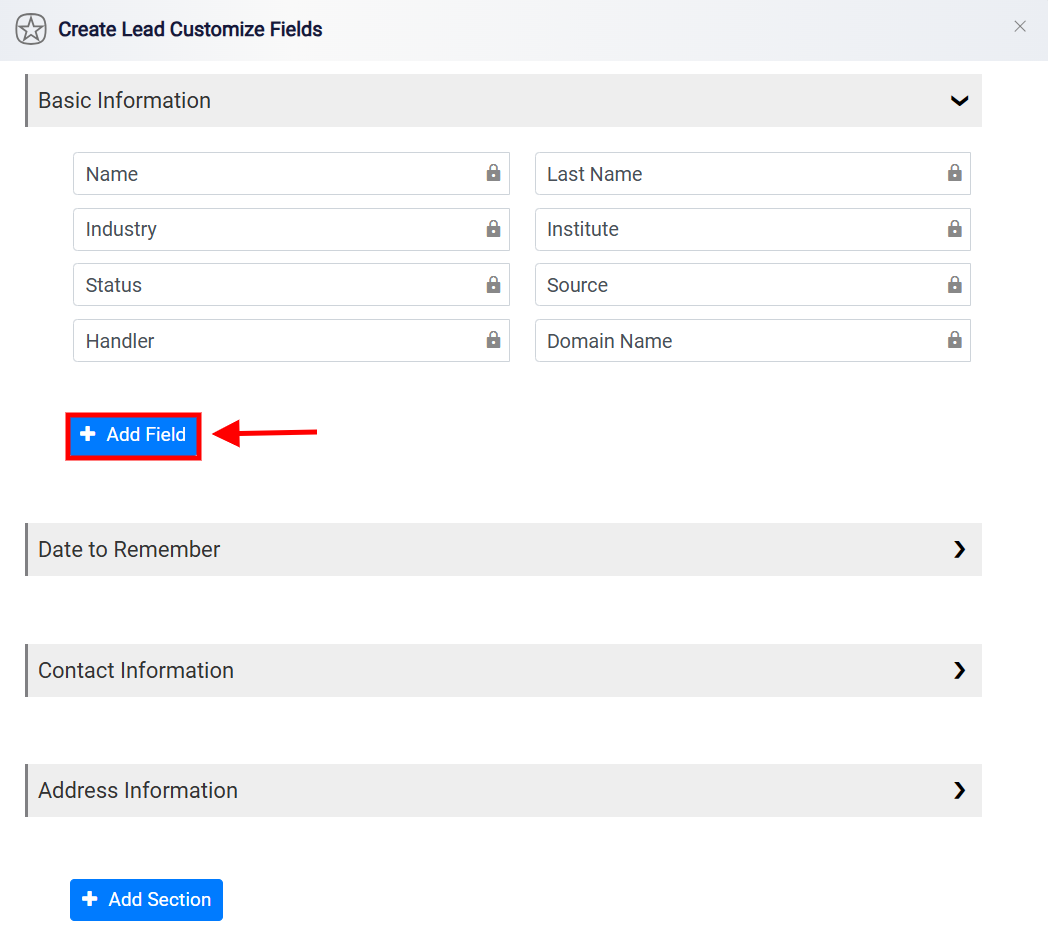
To add a new field to a section, first, select the section where you want to place the field. Then, click the Add Field button located at the bottom of the section you’ve chosen.
To create a new field, start by specifying the type of information that this field will hold in the Label Box provided.
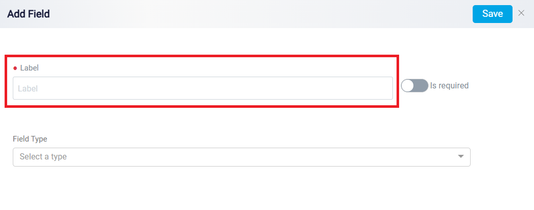
The Field Type controls how information will be entered into that field. For example, a Text Input field is used for short answers, while a Text Area field is used for longer notes or explanations. A Number field is used when the answer should be numeric, and a Date Picker field is used when the user needs to select a date. A RunSensible User field allows the user to select one of the users already registered in the system.
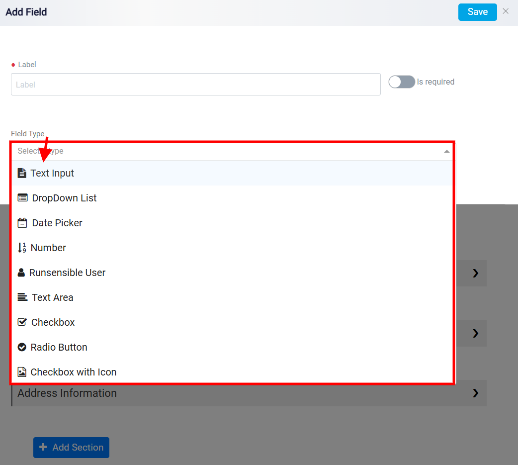
Here are all the options you have:
Text Input: This field allows the user to enter freeform text, such as names, addresses, or short responses. It is useful for single-line text entries.
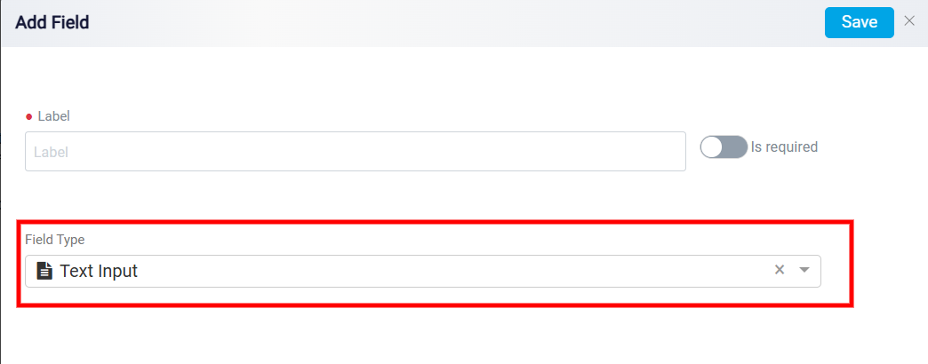
Dropdown List: This field provides a list of predefined options for the user to select from. This field is particularly useful for cases where consistency is critical, such as selecting a state, category, or other predefined criteria, making data entry more efficient and reliable.
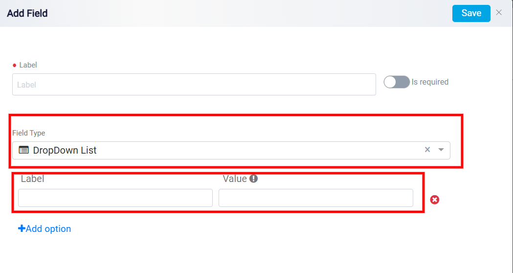
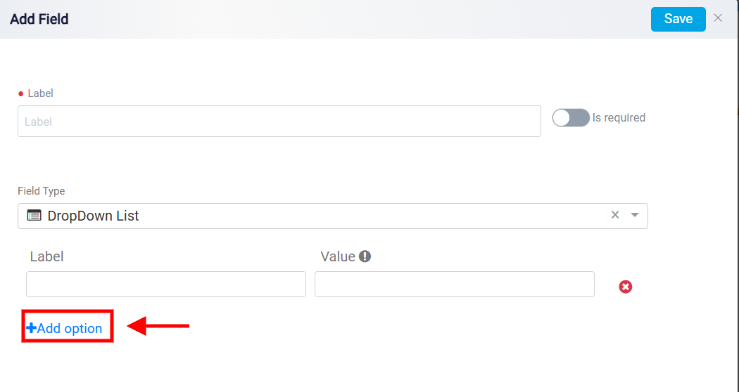
After selecting the Dropdown List, a panel will appear at the bottom of your screen. This panel includes a Label box and a Value box. In the Label box, type in the name of the option you wish to include in your list. Once you’ve entered the name, press the Tab key on your keyboard. This action triggers the system to automatically fill the Value box with the accurate information related to the name you provided.
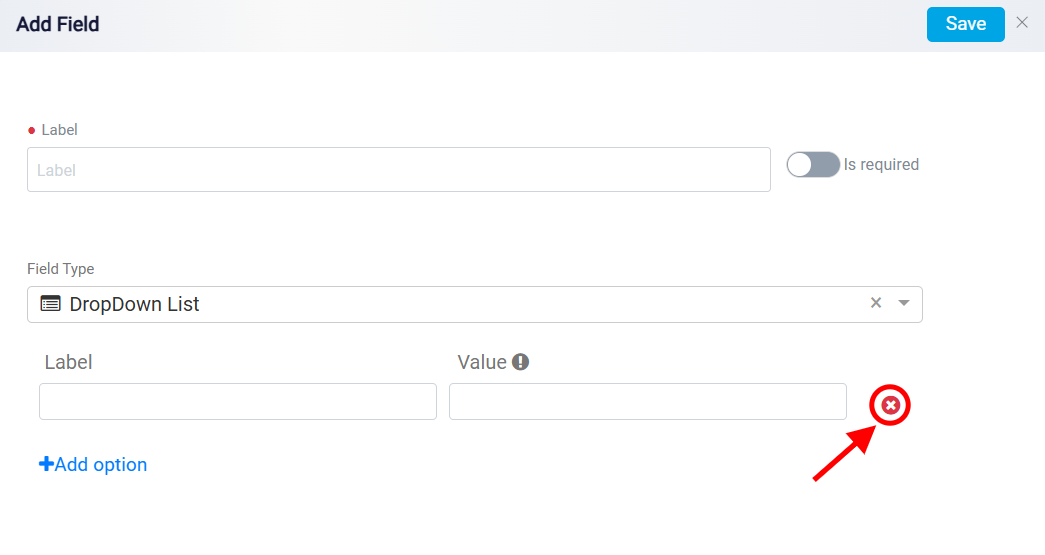
If you find yourself with an excess of options without content, you can easily manage this by clicking on the Remove button next to the respective options.
If you want to add more than one option to your list, just click the Add Option button. You can add as many options as you need.
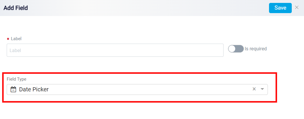
Date Picker: This field allows users to select a specific date from a calendar interface. It is ideal for fields like appointment dates or deadlines.
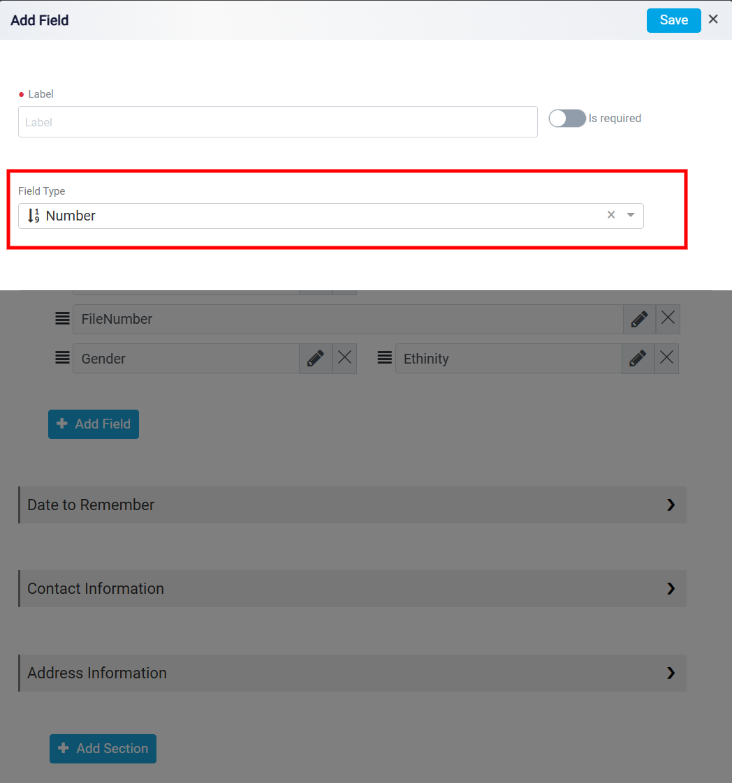
Number: Choose this field when you require quantitative data, such as age, price, quantity, or any other numeric value. Users can input numbers into this field, making it suitable for collecting numerical information.
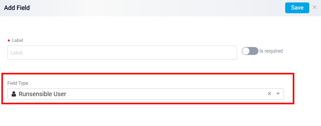
RunSensible User: Choose this option for the field if you want to link the information with one of your employees who has a RunSensible account.
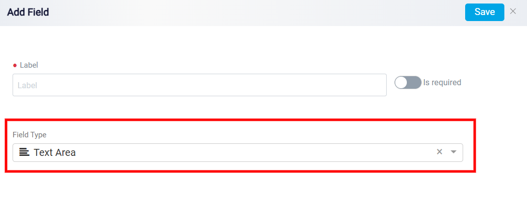
Text Area: Select the Text Area field when you need users to provide descriptive or textual information. This is ideal for capturing information like names, addresses, comments, or non-numeric data. Users can enter text or sentences in this field, making it versatile for various types of textual information.
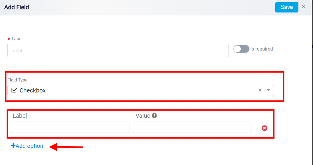
Checkbox: To make multiple selections in your information tab, choose the Checkbox. Similar to the Dropdown List field, selecting this field opens new Label and Value boxes, allowing you to assign a name and value to the field. You can Remove it if it’s no longer needed or add more options if required by clicking the Add Option button. Each time the user clicks Add Option, a new row appears where another label and value can be entered. This is how users create all available choices for dropdowns, checkboxes, radio buttons, and other option-based fields.
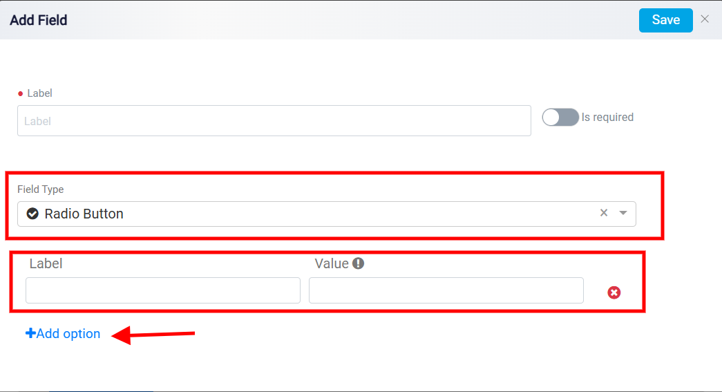
Radio Button: To make a single choice in your information tab, choose the Radio Button from the Field Type drop-down menu. Similar to the Dropdown List and Checkbox fields, selecting this field opens new Label and Value boxes, allowing you to assign a name and value to the field. You can Remove it if it’s no longer needed or add more options if required by clicking the Add Option button.
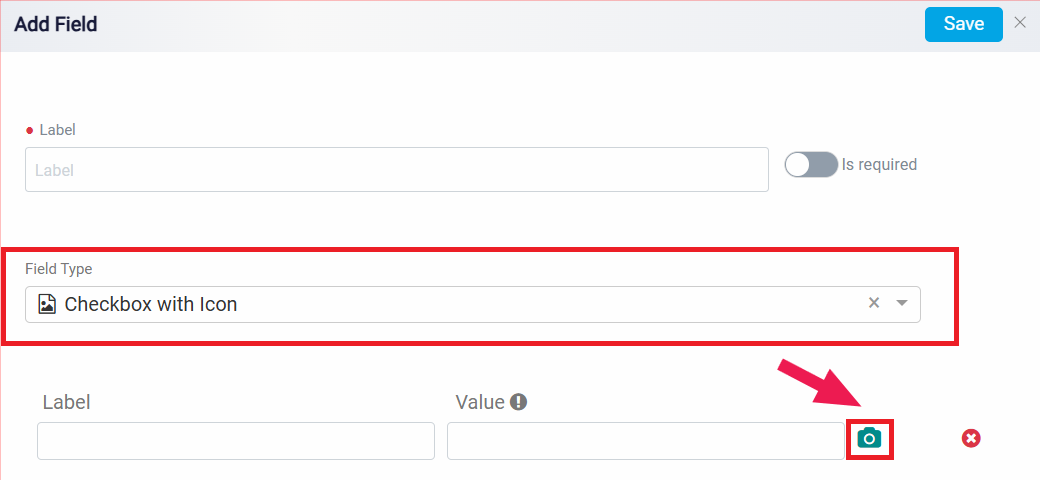
Checkbox with Icon: If you prefer to add distinct icons to each option in the checkbox list, opt for the Checkbox with Icon. This allows you to customize and visually differentiate each choice within the list by assigning unique icons.
Similar to the Dropdown List, Checkbox, and Radio Button fields, selecting this field opens new Label and Value boxes, allowing you to assign a name and value to the field. You can Remove it if it’s no longer needed or add more options if required by clicking the Add Option button.
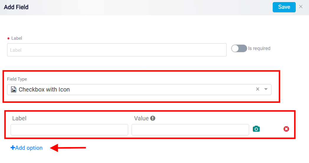
When selecting the Checkbox with an Icon, click on the Camera button positioned on the right side of the value box to add the appropriate icon to the selected option.
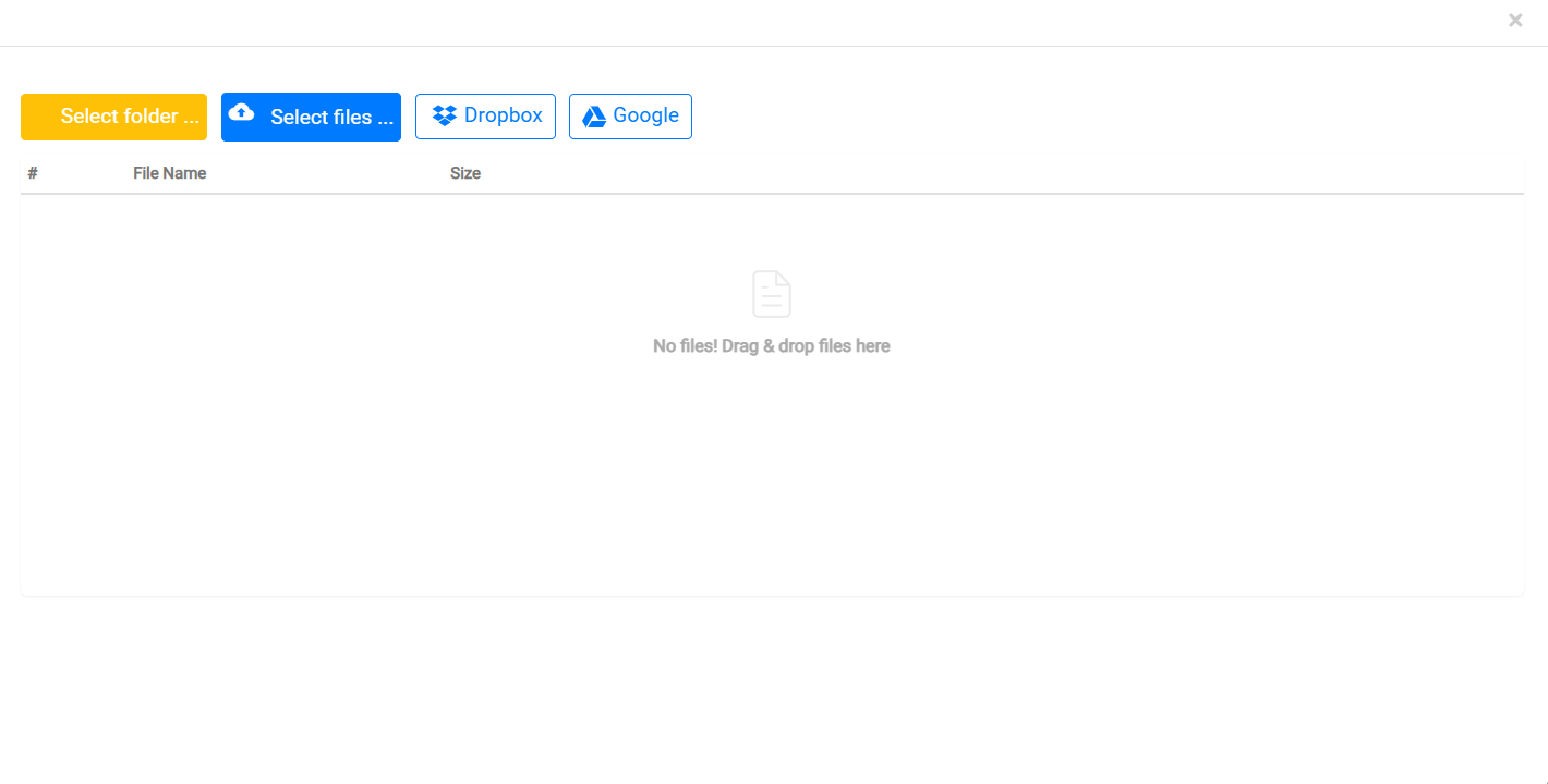
From there, choose the desired icon file on your device, and it will be seamlessly uploaded and attached to the option.
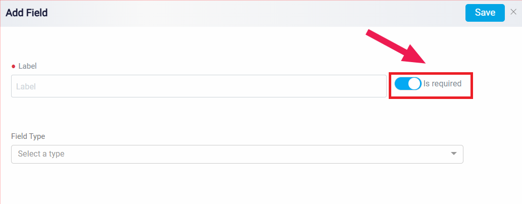
The Is Required option is used when the field must be completed before the lead information can be saved. If this option is turned on, the user will not be able to save the lead information without filling in that field.
Please keep in mind that it’s important to avoid leaving any of the specified boxes empty when creating your list. If you find yourself with an excess of options without content, you can easily manage this by clicking on the Remove button next to the respective options. However, note that the system may only allow you to save your changes if there are no empty options in your list.
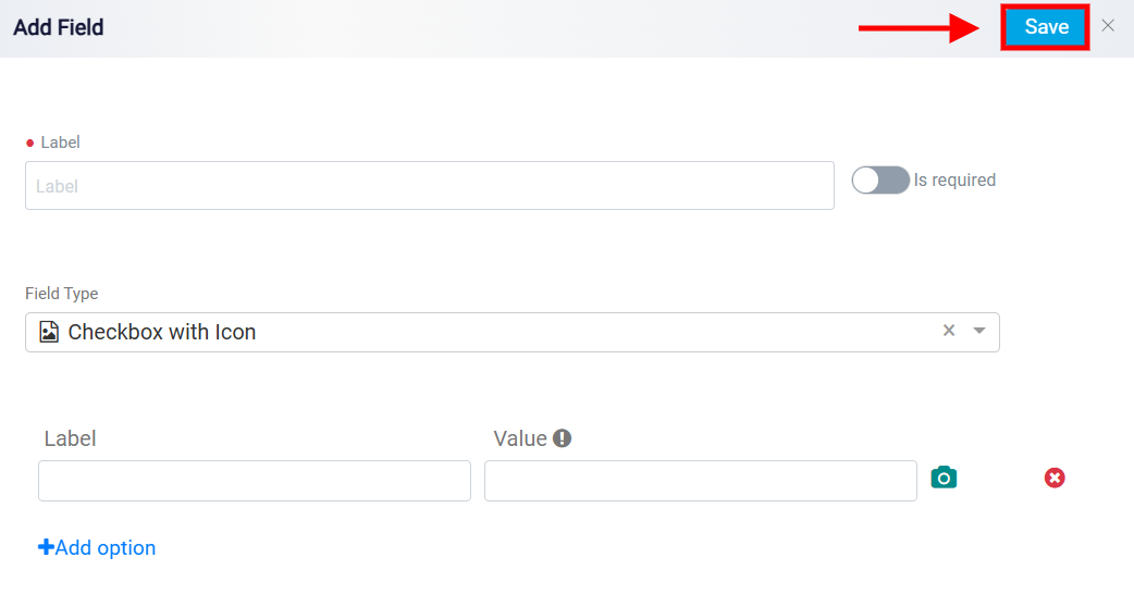
The same rule applies when adding icons. If you’ve chosen the Checkbox with Icon, every option in your list must have a corresponding icon. To successfully save your changes, ensure that each option is paired with an uploaded icon.
After making your desired changes, click the Save button to save all the modifications.
Adding Custom Sections
The Add Section button allows the user to create a new section in the lead’s Information tab. After clicking it, the user enters the section name and saves it. This is useful when the firm wants to organize custom fields under a separate category instead of placing them inside the default sections.
Custom fields and custom sections created here are available in the lead’s Information tab. They do not appear in the initial lead creation form. To view or complete these custom fields, the user must open the lead record and go to its Information tab.
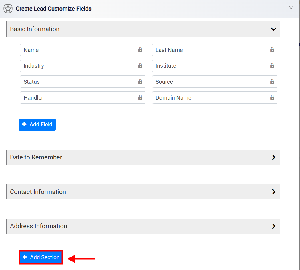
When the input box appears, give the section a name, and click Save. Your new section will be saved in the Lead Information Tab. You can create as many sections as needed.
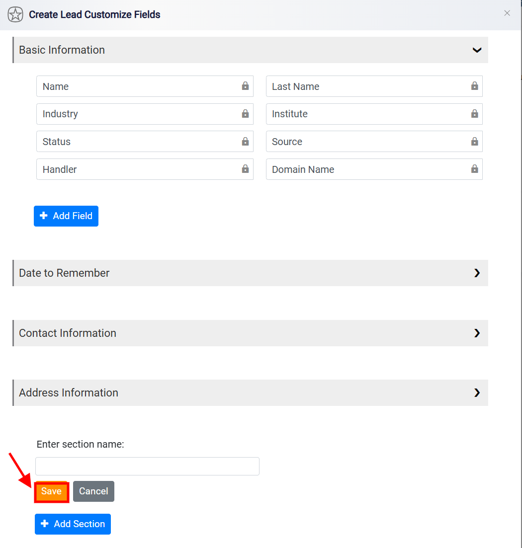
Also, the Cancel button is designed to discard any unsaved changes made during the customization process and exit the operation without saving or applying those modifications.